Donation Page Builder
Donation Pages allow you to build custom pages and utilize features to increase conversions. Within the Builder, you will find easy-to-use tools to create beautiful pages to meet your fundraising goals!
Page Name
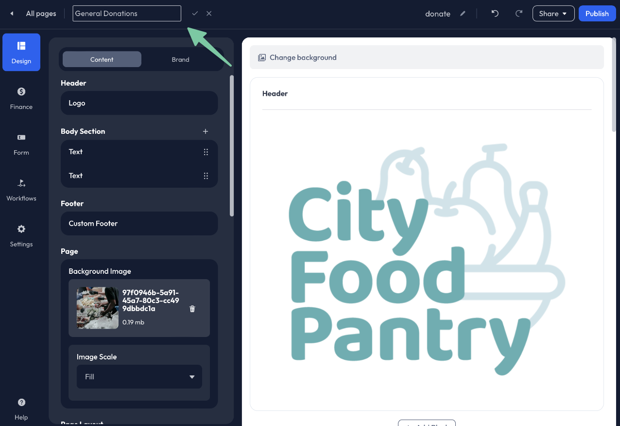
Apply a custom Page Name to the Donation Page by clicking the Pencil icon in the upper left corner of the Builder toolbar. Enter your new Page Name, then click the Check to save your changes.
The Page Name is not visible to donors. This is an internal field that helps keep your pages organized and easily identifiable.
Page URL (Page Slug)
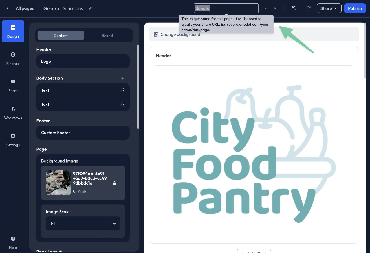
The Page URL (Page Slug) is what makes each individual Action Page unique. Each Page Slug must be unique to each page. If you have already used donate as the Page URL for another Action Page, it cannot be used again.
Click the Pencil icon in the upper right corner of the Builder toolbar. Enter your new Page Slug, then click the Check to save your changes.
Examples: donate, give, contribute, giving-tuesday, support etc.
The Page URL is the last portion of the Share URL for your Action Page.
Presets
Presets allow you to save a configuration for individual areas of the Builder. These Presets can then be used for other Action Pages, limiting the need to manually edit each new page from scratch.
Presets are available within the following areas of the Builder:
- Design>Brand
- Finance>Amounts
- Finance>Funds
- Finance>Payments
- Form
- Workflows>Upgrades
- Workflows>Recovery
- Workflows>Receipt
- Settings>General
To create a new Preset, click Save as Preset within the Preset block pinned to the top of the tab within the Builder. Next, enter a custom Preset Name. The Preset can then be used for other Action Pages.
The Presets feature is optional. To bypass creating a Preset, click Publish in the upper right corner of the Builder. Note that the Preset block will state "No Preset."
Design

Access the Design tab within the Donation Page Builder to add content and customize the branding for your Donation Page.
Simply adding a logo or image and choosing an Action Button color is an easy way to elevate your page to the next level!
Content
The Design>Content tab allows you to add a custom header and content blocks such as Text, Images, and Video and enable features like Exit Intent and Impact.
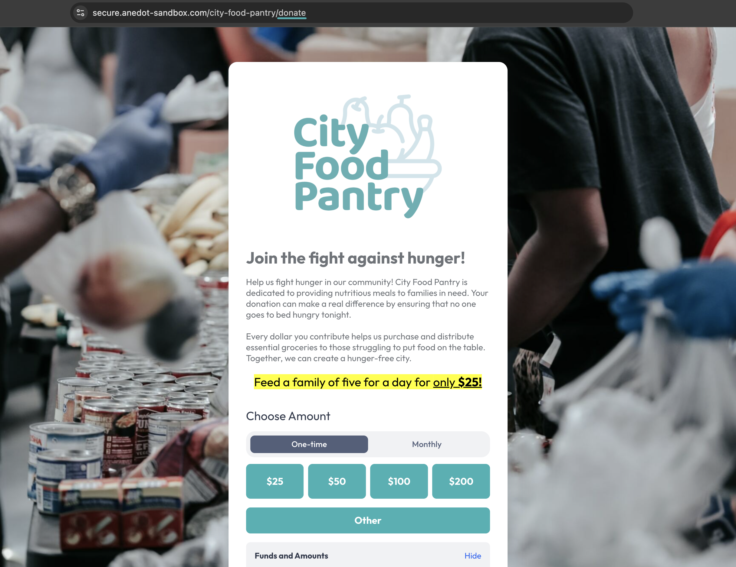
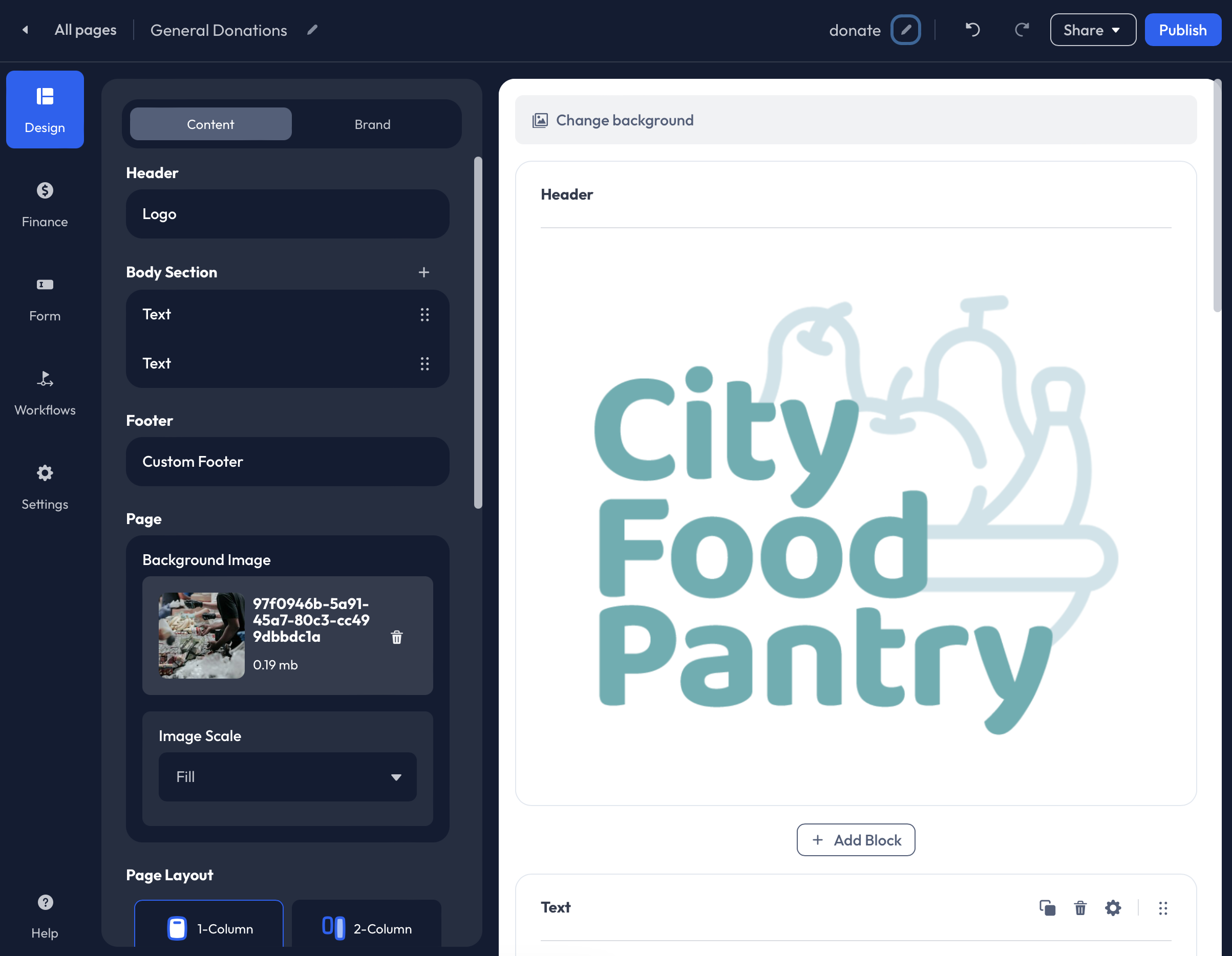
Header
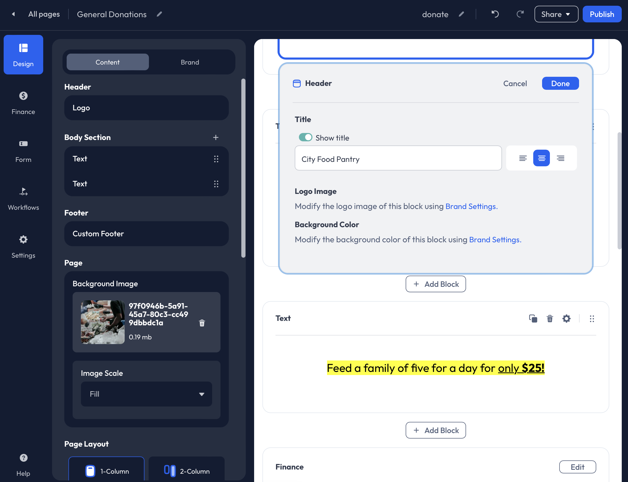
Edit the Header within the Design>Content tab to apply a Title to your page. We recommend applying a Title if you do not have a Logo available.
To add a Title to your page:
- Hover over Header>Title. This field will be labeled Logo if a logo image has been applied to the Action Page.
- Click the Pencil icon to edit.
- Next, enable the Show Title toggle.
- Optionally, enter custom text into the Title field. The account's Display Name will automatically be applied in this field.
- Adjust the Alignment.
Click Done in the upper right corner of the Header Editor.
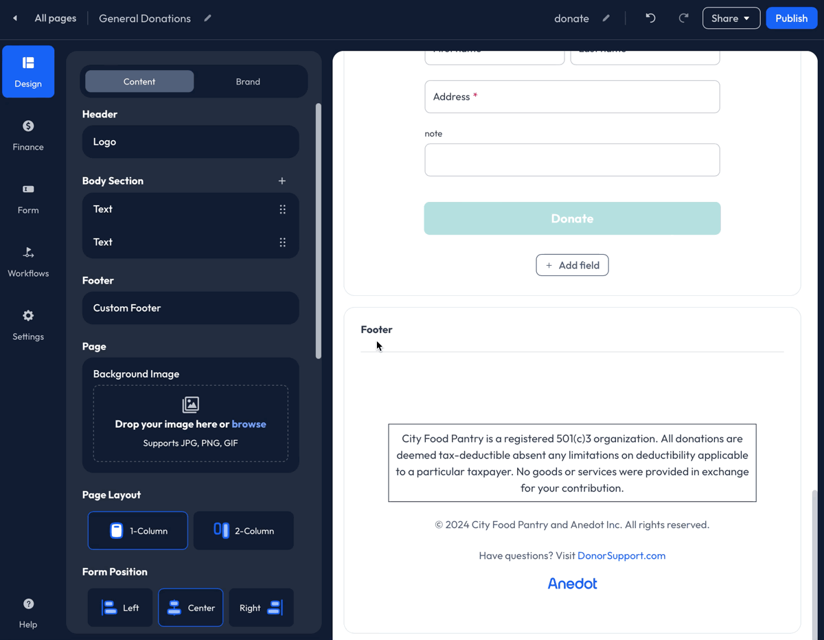
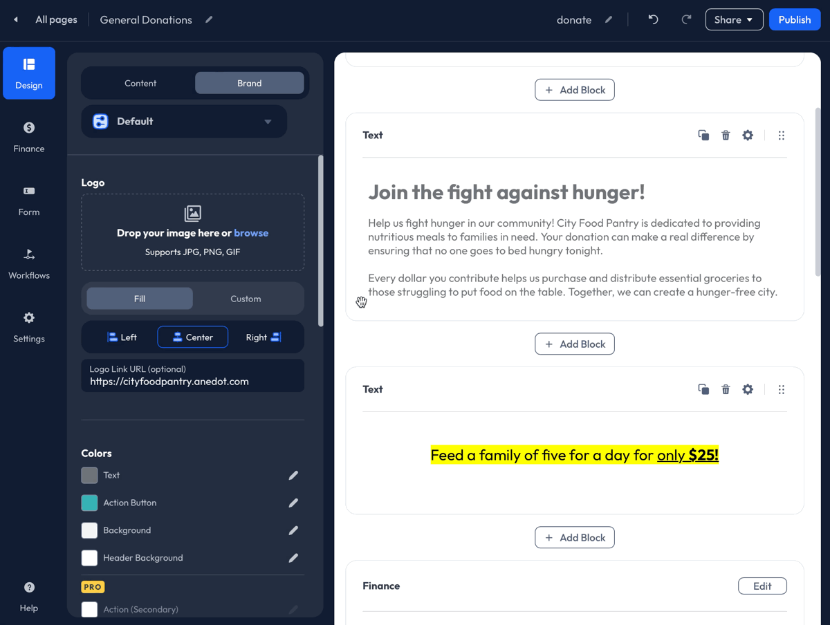
Body Section
Add content blocks within the Body Section of your Donation Page within the Design>Content tab. The following blocks are available:
- Text: Use the Text block to add a custom message to your page.
- Image: The following files are supported: JPG, PNG, and GIF
- Video: The following video links are supported: YouTube, Vimeo, Facebook, and Rumble
- Rumble: To apply a video hosted by Rumble to your page, utilize the Embed iFrame URL from Rumble to link your video to your Anedot page.
- Divider: This can be used as a page break or as a design element.
- Impact: Encourage giving and show your supporters the impact of their gifts. This feature is for visual purposes only and will not impact the donation amount processed.
- Timer: Use the timer to set a deadline or countdown to encourage support from your donors. Setting a deadline or countdown using the Timer block does not disable the Action Page once the timer has run out. The timer will be set to zero. The time will need to be manually removed or updated to reset the deadline or countdown.
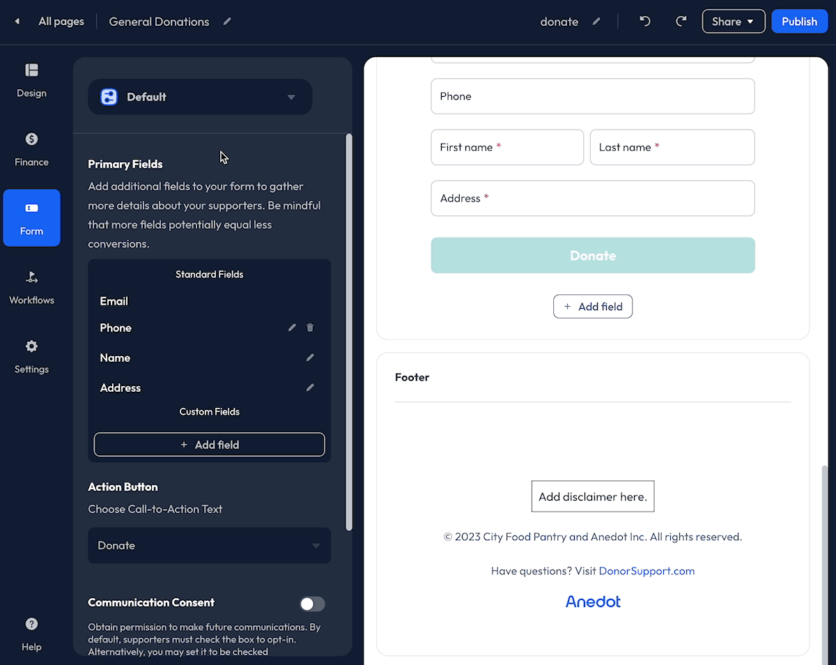
Footer
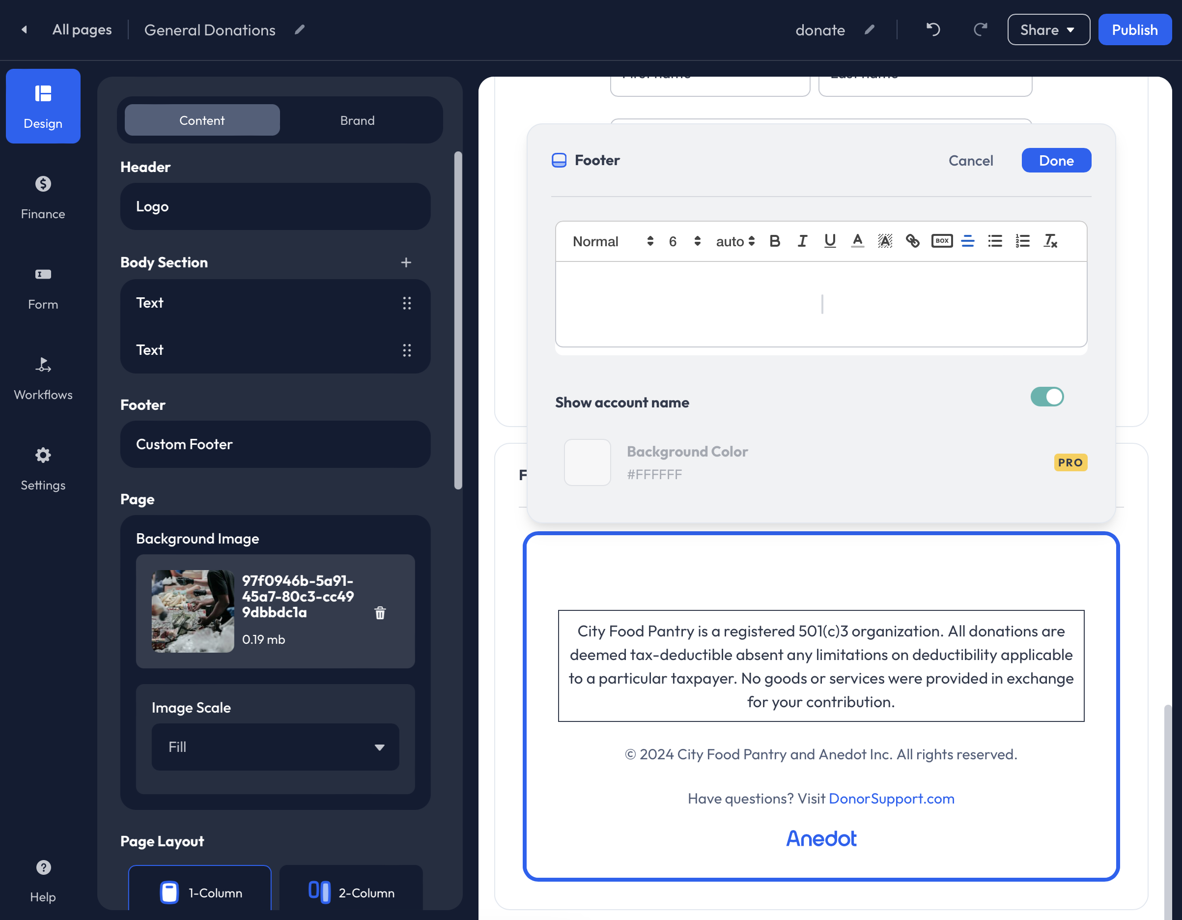
We recommend applying Disclaimer language at the Fund level within the Settings>Finance>Funds tab of your account. When applied at the Fund level, the Disclaimer language will be applied to all Action Pages that the Fund is connected to.
To add a Custom Footer to your Donation Page, follow the steps below:
- Hover over the Footer>Custom Footer field available within the Design-Content tab of the Donation Page Builder.
- Click the Pencil icon to edit.
- Within the Text Editor, enter your custom text.
- Click Done in the upper right corner of the Text Editor.
If you want a Disclaimer to apply to every page, you should add it to the Fund Disclaimer. Disclaimer text that has been applied at the Fund level will be shown in the Builder Display but cannot be edited within the Footer Editor.
Background Image
Add a Background Image within the Page block of the Design>Content tab. Use the Image Scale to adjust the layout of the Background Image.
For optimal resolution, we recommend the Background Image size be at least 1920 x 1080.
When placing a Background Image, the image will not be displayed within the Builder. Once you have added a Background Image or made adjustments, we recommend publishing the page, then copying the Share URL and opening the link in a new tab in your browser.
Page Layout
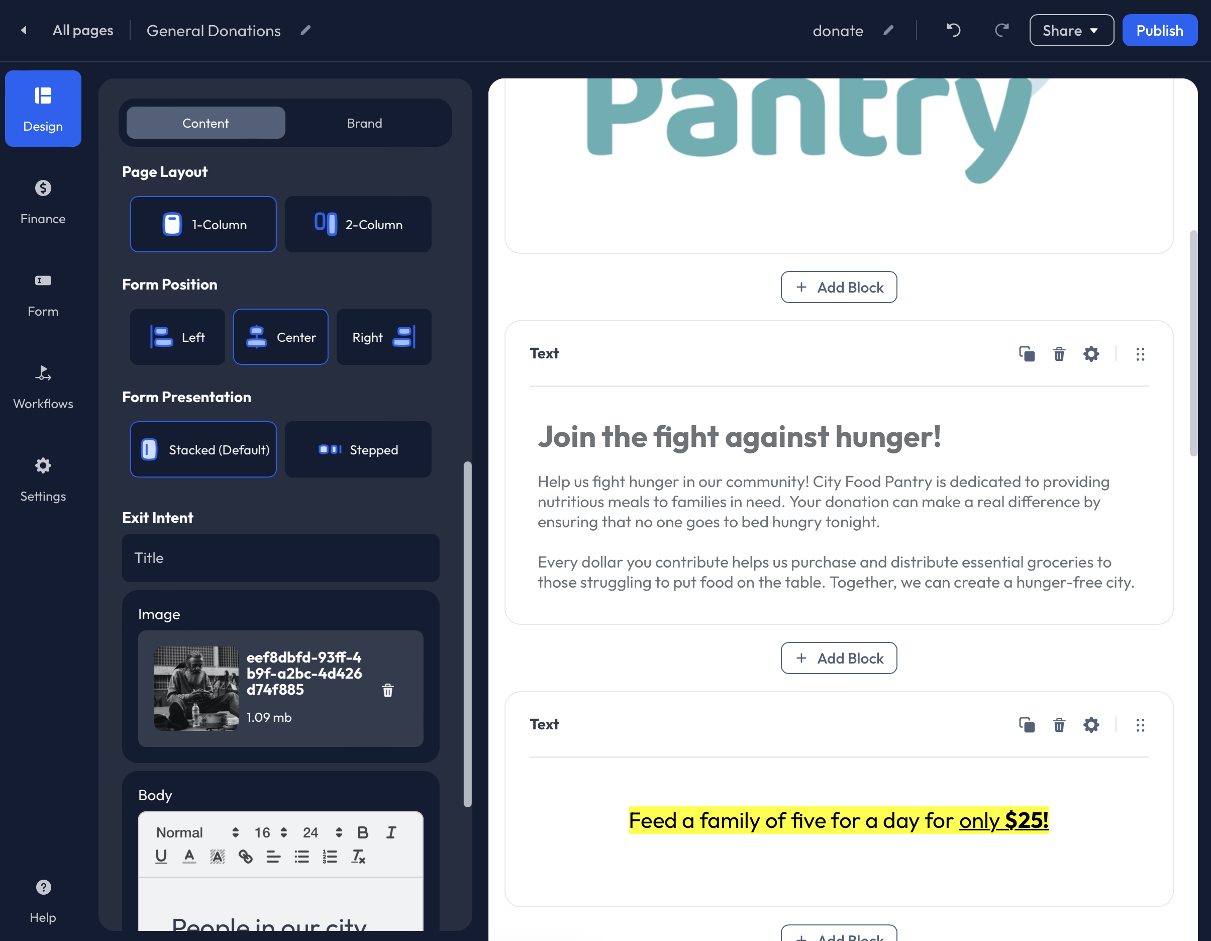
Within Design>Content, adjust your Page Layout by selecting the following:
- 1-Column
- 2-Column
The 2-column layout type is recommended for Donation Pages with multiple Content Blocks (Text, Images, Videos, etc.). When the 2-Column layout is selected, all Content Blocks will be shown in the left column; the right column will include the Finance, Form, and Payment Blocks.
Form Position:
- Left
- Center
- Right
Form Presentation
- Stacked (Default)
- Stepped
The Stepped form presentation separates the Finance, Form, and Payment Blocks into individual steps.
Example: Single-Column, Center Position, Stepped
To view the customizations you have made to the Page Layout, we recommend publishing the page, then copying the Share URL and opening the link in a new tab in your browser. The changes made to the Page Layout will not be displayed within the Builder.
Exit Intent
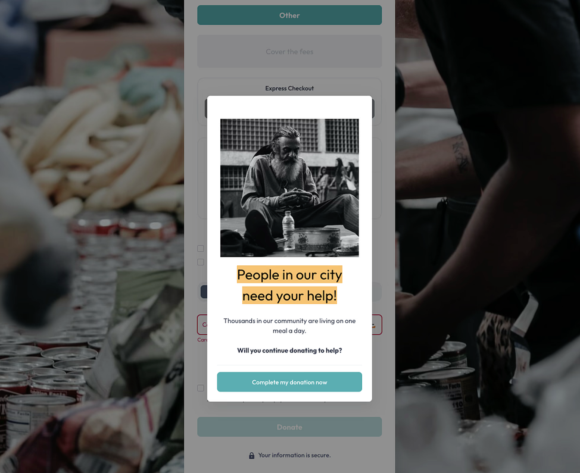
Enabling the Exit Intent feature for your Action Page will cause a popup to appear when a supporter attempts to exit the page before completing their submission.
Customize the Exit Intent feature by adding a Title, Image, or GIF, and a custom Message.
When the Exit Intent feature is enabled on an Action Page, an ?exitIntent=true URL parameter will be added to the URL for tracking purposes. This parameter will only be passed when a supporter interacts with the Exit Intent feature and makes a successful submission. You can locate this data within the CSV export under the Referrer to Form URL column or in the Referrer field included in your data relays to your connected integrations.
Brand
The Design>Brand tab allows you to upload a custom Logo, edit the color scheme, and adjust the type settings.
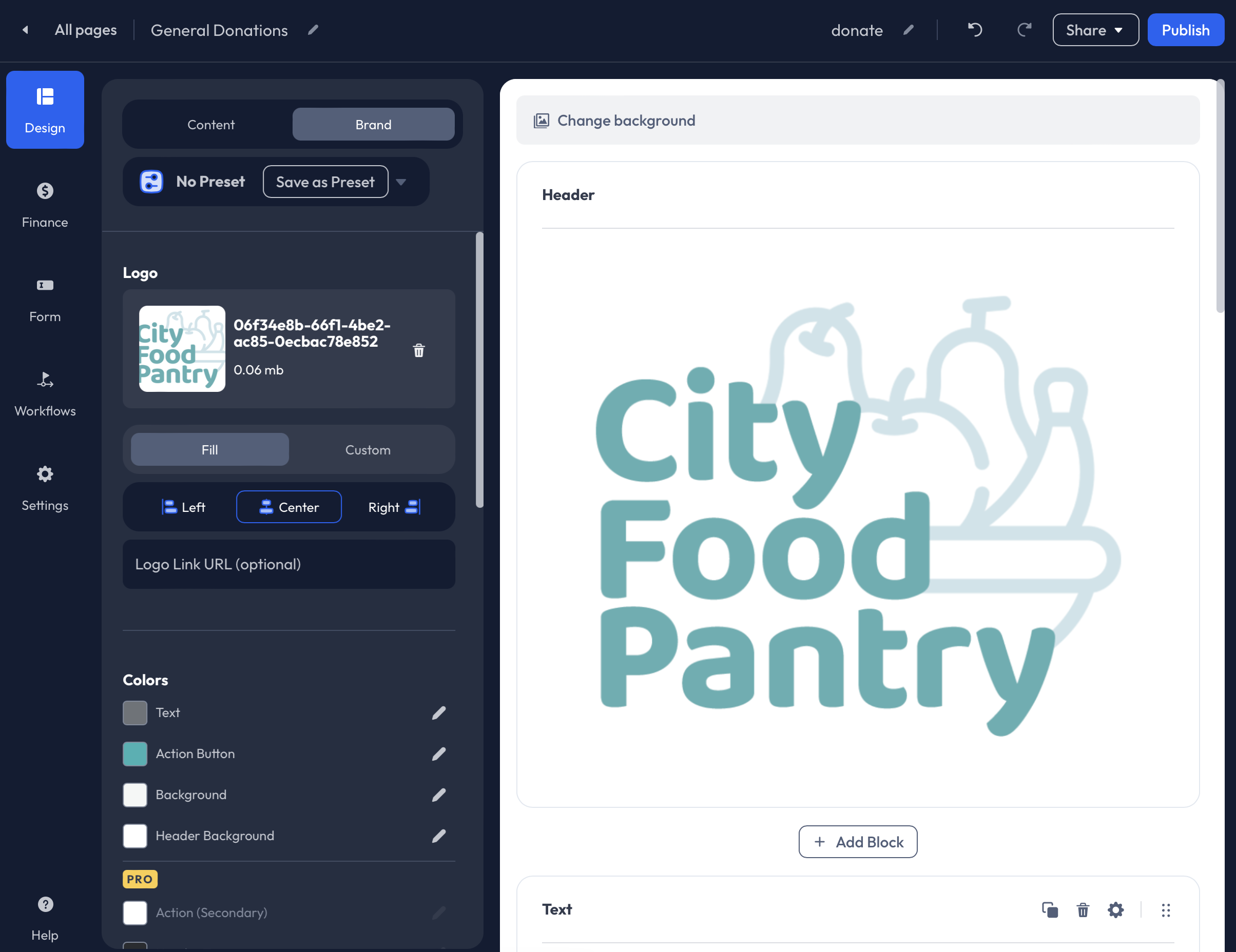
Logo
To add a Logo to the Donation Page, follow the steps below:
- Drag + Drop an image into the Logo uploader, or click Browse to select an image from your device. If an image has previously been uploaded to the fundraising account, click Browse to access the Media Manager. Images that have been uploaded to the account will be available for use.
- Next, choose Fill or Custom to adjust the size of your image. Fill will expand the image to fill out the entire Header block. When a Custom size is entered, padding is automatically added to the Logo image. 16px is added horizontally, and 8px is added vertically.
- Optionally, enter a Logo Link URL. Entering a Logo Link URL allows the image to become clickable to easily redirect your supporters to another webpage.
It is recommended that Logo images are at least 450 pixels wide.*
Colors
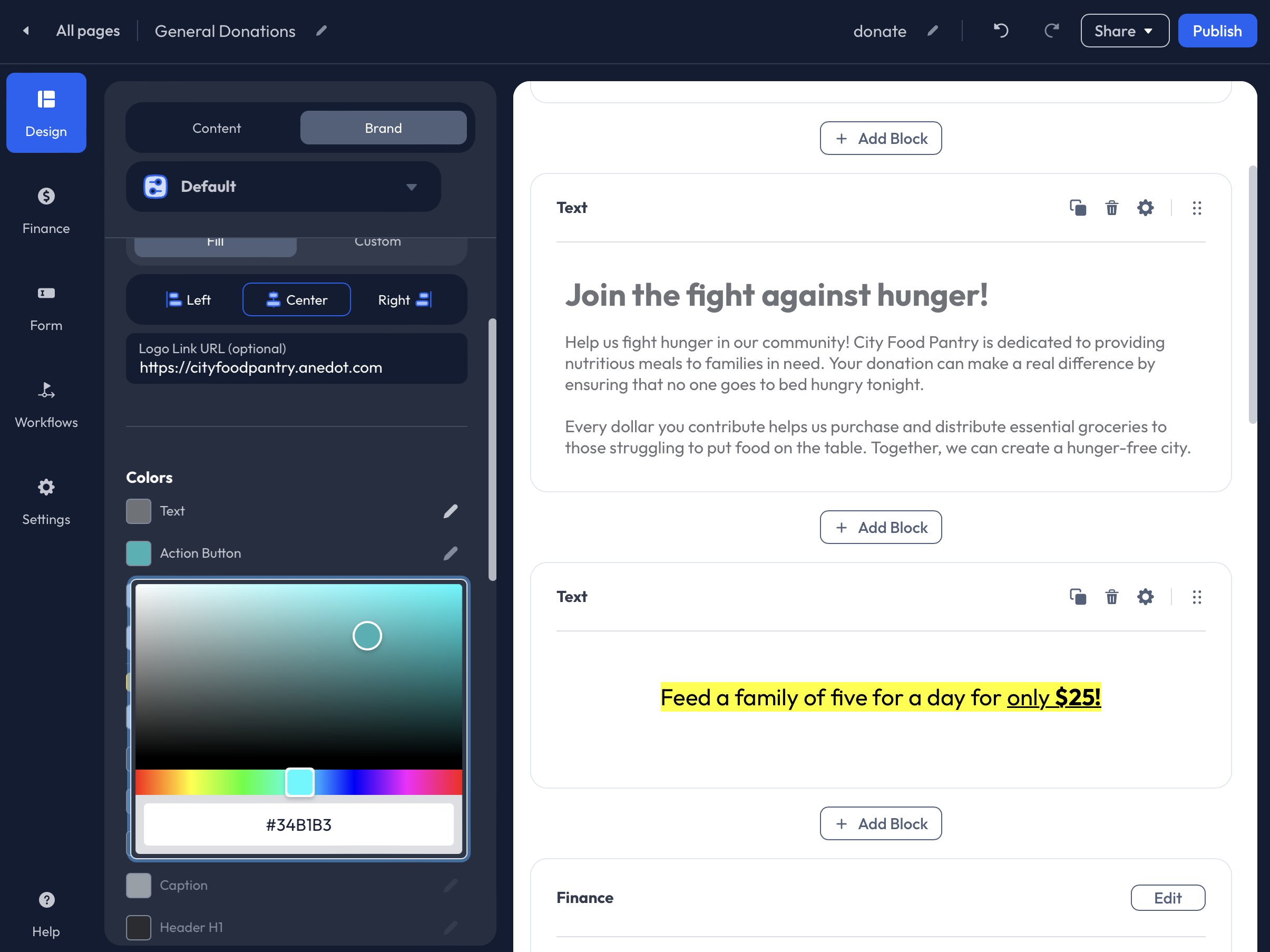
Customize the color scheme of your Donation Page to reflect the organization’s branding.
Text: The Text color selected will be the default color used for Text Blocks added to the Donation Page. The Text color can be edited further within the Text Editor.
Action Button: The Action Button color will affect the Preset Amount buttons and the Donate button at the bottom of the Donation Page.
Background: If a Background Image is not uploaded to the Donation Page, the selected color will be used to fill the background.
Header Background: If the Logo image does not fill the Header block, the Header Background color will fill behind the logo.
Additional Color customizations are available for organizations with Pro features enabled. If you would like access to Pro features, please contact our Support team here.
Type Settings
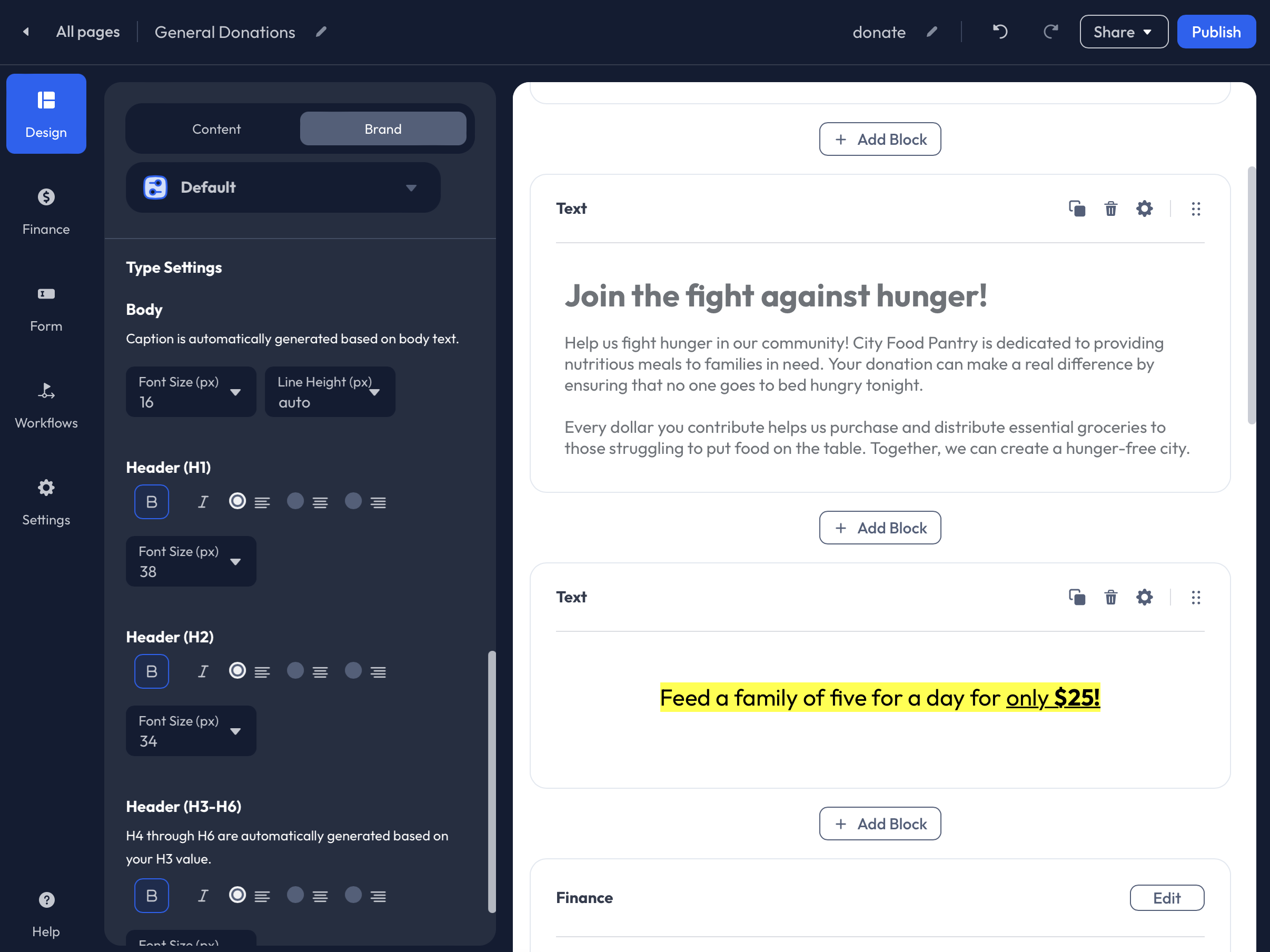
The Type Settings set within the Design-Brand tab will affect the Text Blocks on the Donation Page. You may make adjustments to the following:
- Body
- Header (H1)
- Header (H2)
- Header (H3-H6)
Finance
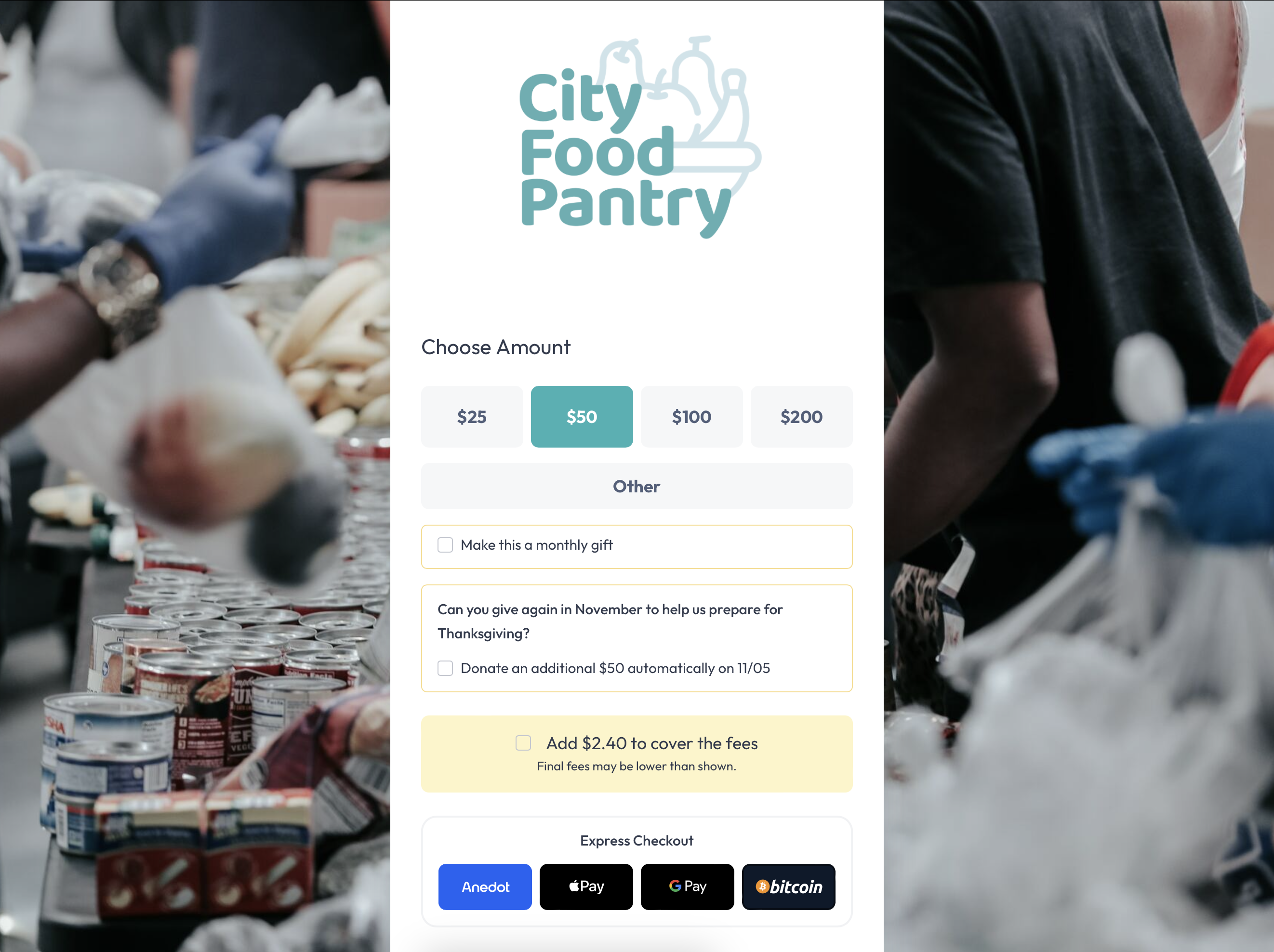
Within the Finance tab of the Builder, you can enable Preset Amount buttons, set Transaction Limits, connect Funds, adjust Payment Methods, and enable the Donor Covers Fee feature.
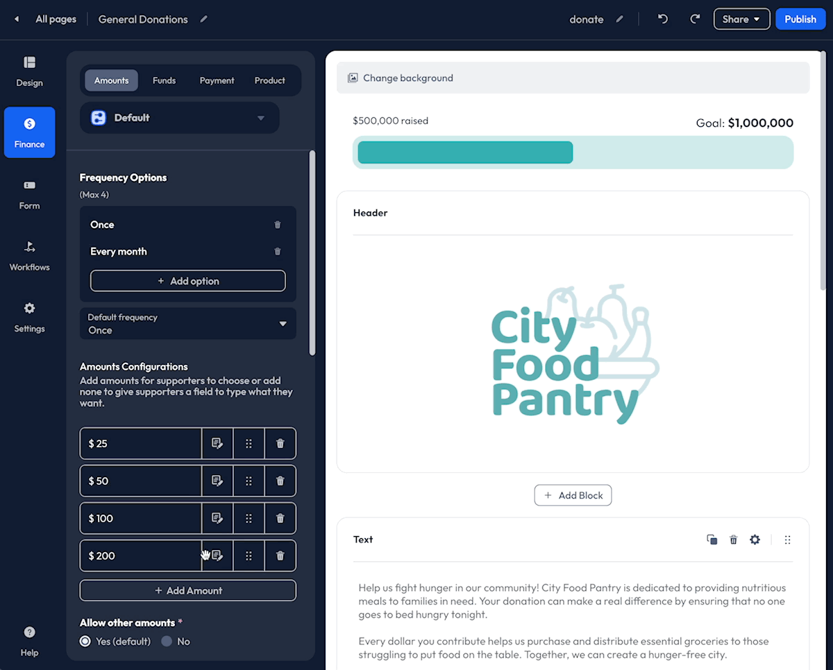
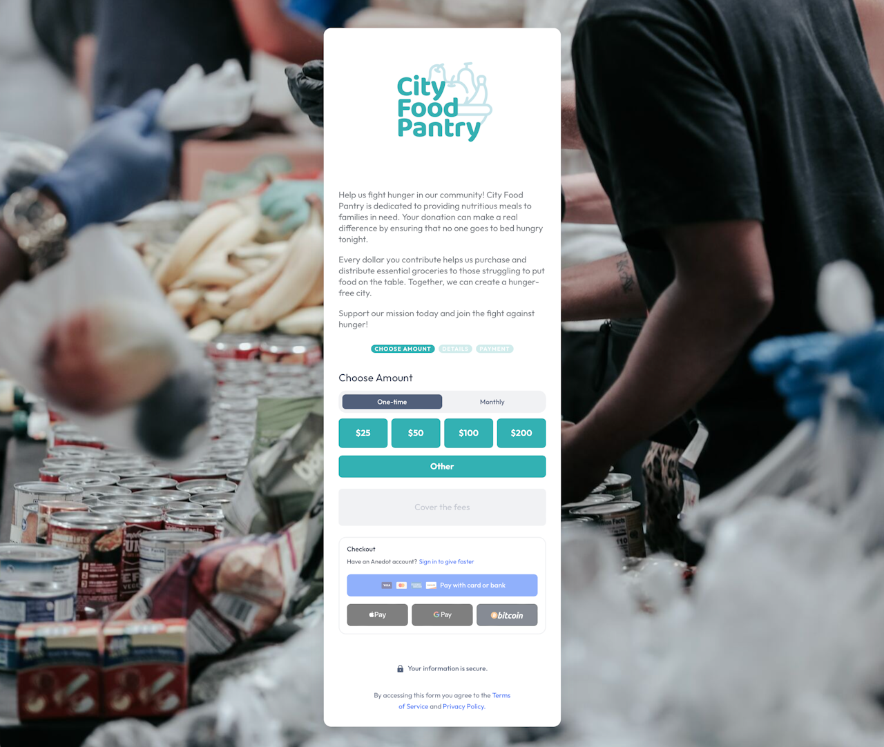
Amounts
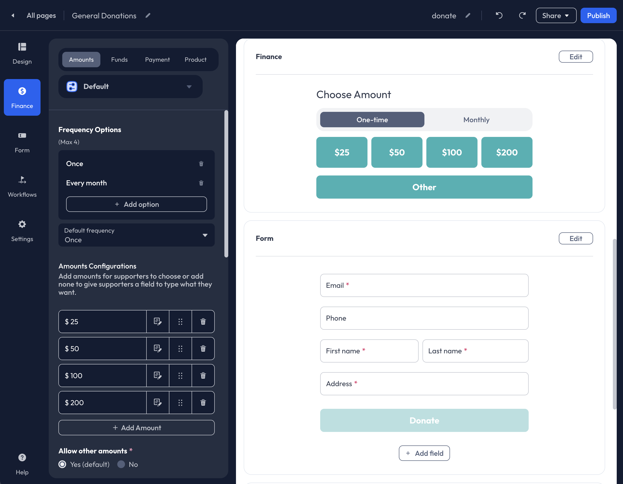
Within the Finance>Amounts tab, you can customize the following:
- Frequency Options (recurring commitments)
- Preset Amounts
- Transaction Amount Limits
- Future Pledge Upgrade
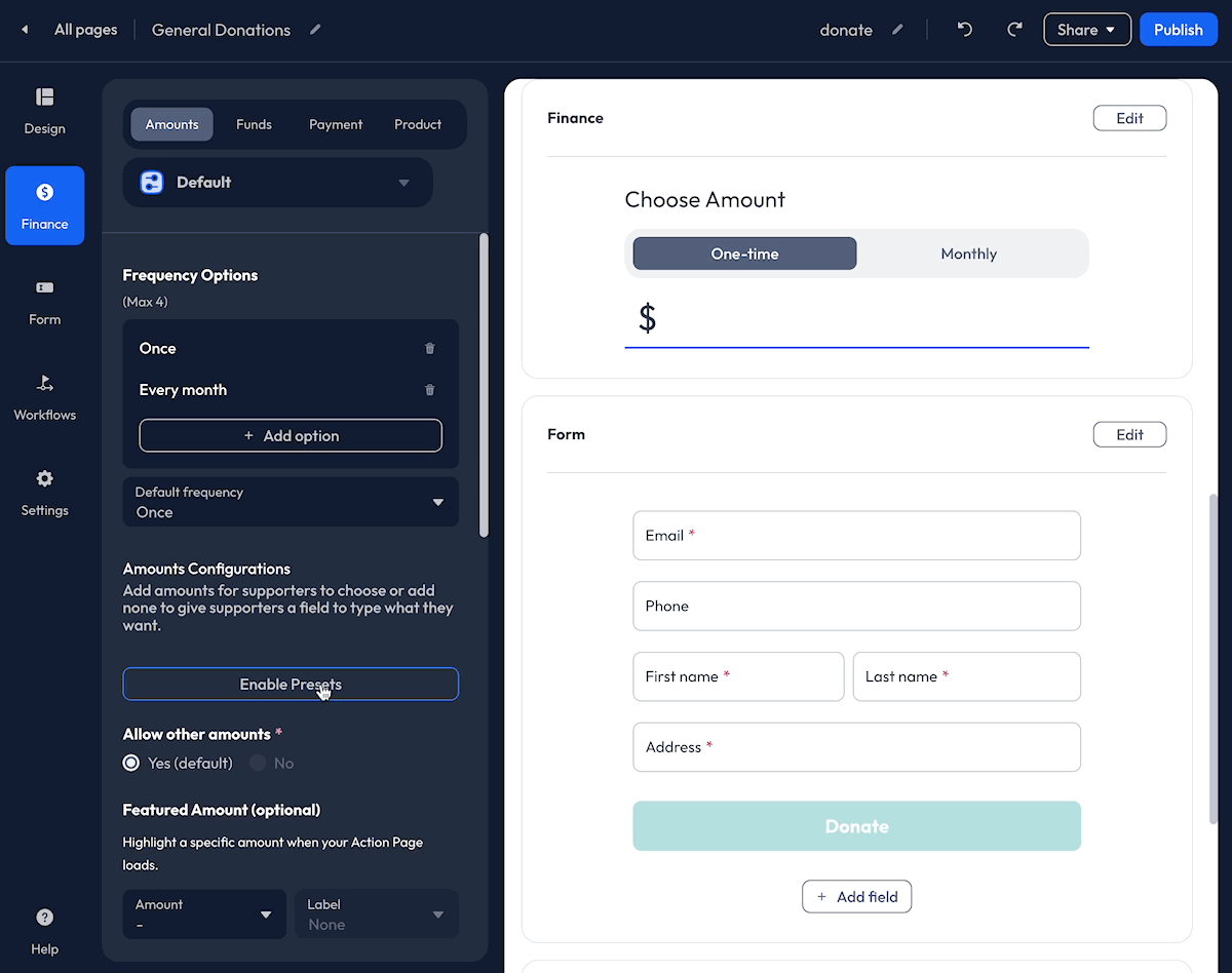
Frequency Options
Select the Frequency Options you would like available for supporters to initiate recurring commitments.
The following Frequency Options are available:
- Once
- Every week
- Every other week
- Every month
- Every quarter
- Twice a year
- Once a year
Up to four frequencies can be enabled at one time. To add a new Frequency Option, click the + Add button. To remove a Frequency Option, click the Trash icon. The Once frequency option can only be removed when other frequencies are enabled.
Default Frequency
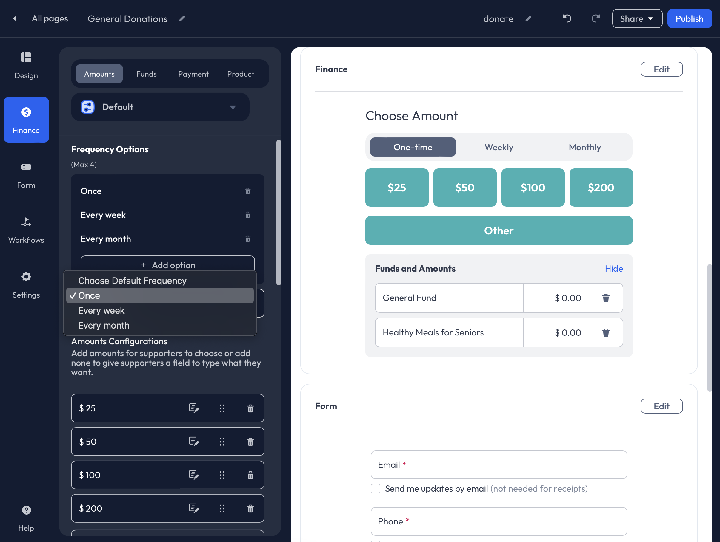
Once is the default frequency for all Donation Pages and is recommended unless the page has been designed specifically for Memberships.
Other Recurring Options
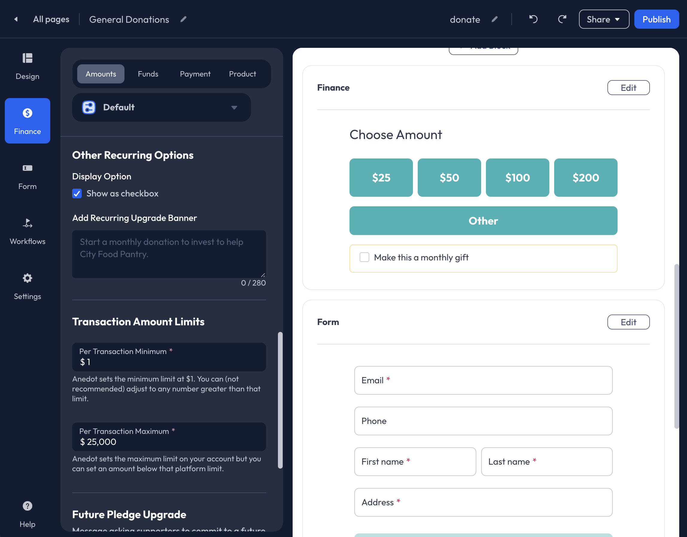
When Once and Monthly frequencies are enabled, you may enable the Show a checkbox feature to replace the individual frequency buttons. With the Monthly Checkbox display, you can also add a Recurring Upgrade Banner. Enter a call-to-action message to this field to encourage monthly commitments. The Checkbox feature is not available for other recurring frequencies.
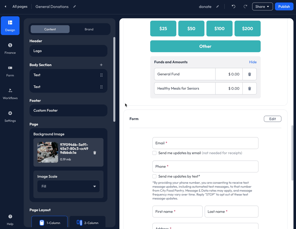
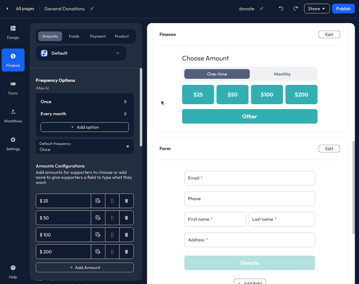
Preset Amounts
Click the Enable Presets button to add Preset Amounts. $25, $50, $100, and $200 will auto-populate as Preset Amounts.
- To Add additional Preset Amounts, click the + Add Amount button.
- To Edit the Preset Amounts, click within the Amount field to enter a new number.
- Add a Description to the Preset Amount fields by clicking the Note icon.
- To Reorder the Preset Amount, use the Tile icon.
- To Delete a Preset Amount, click the Trash icon.
- Allow Other Amounts
When Preset Amounts are enabled, by default, an Other button is included. The Other field allows donors to enter a custom donation amount. When disabled, the Other button is removed from the form, and donors can only select an available Preset Amount.
Featured Amount (Optional)
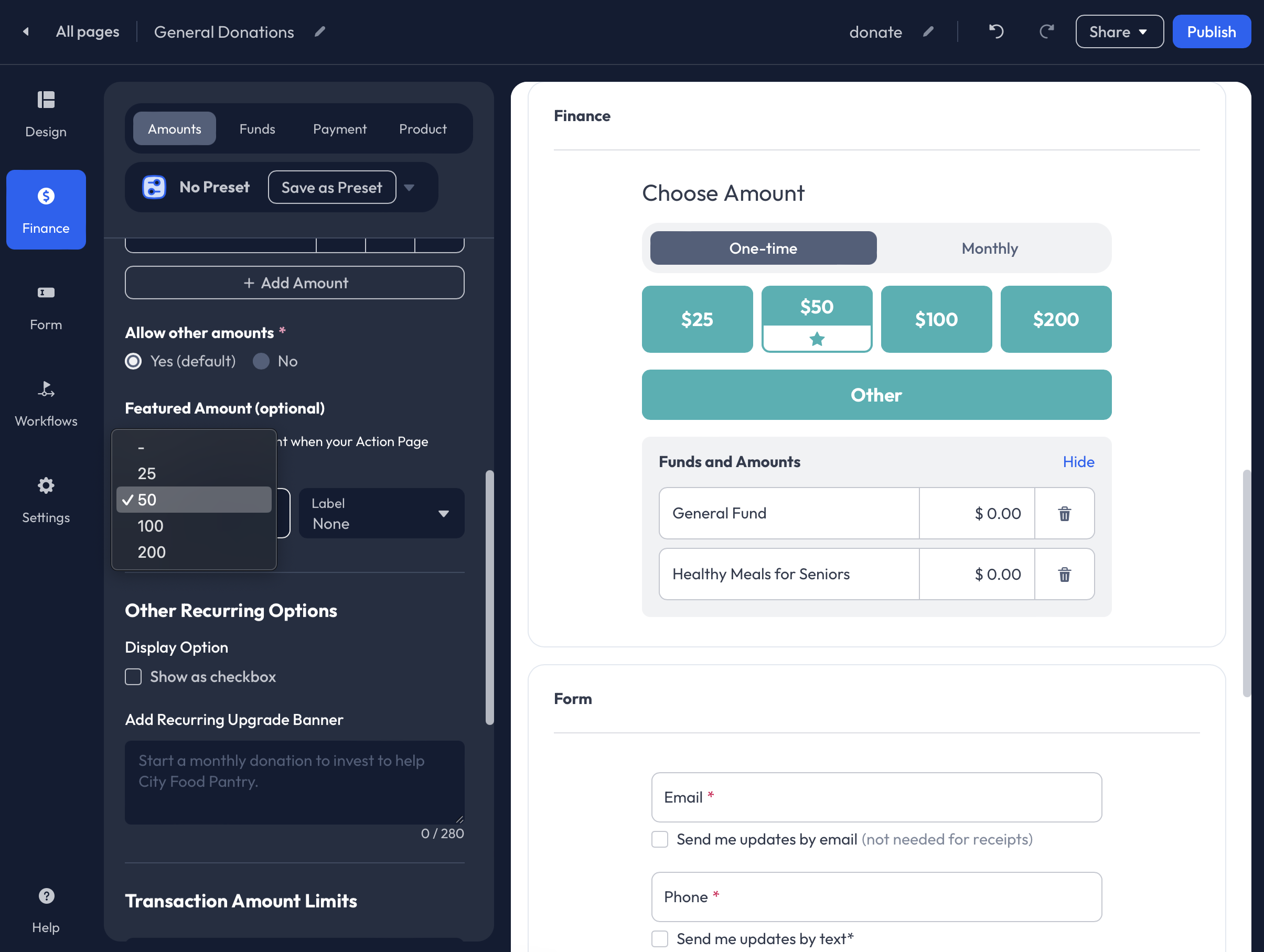
To highlight a specific Preset Amount button, select an Amount from the Dropdown List under the Feature Amounts (Optional) field. By selecting an Amount, the Preset Amount button will be highlighted and include a Star icon. You may also add a Popular label to the button by selecting Popular from the Label dropdown.
Transaction Amount Limits
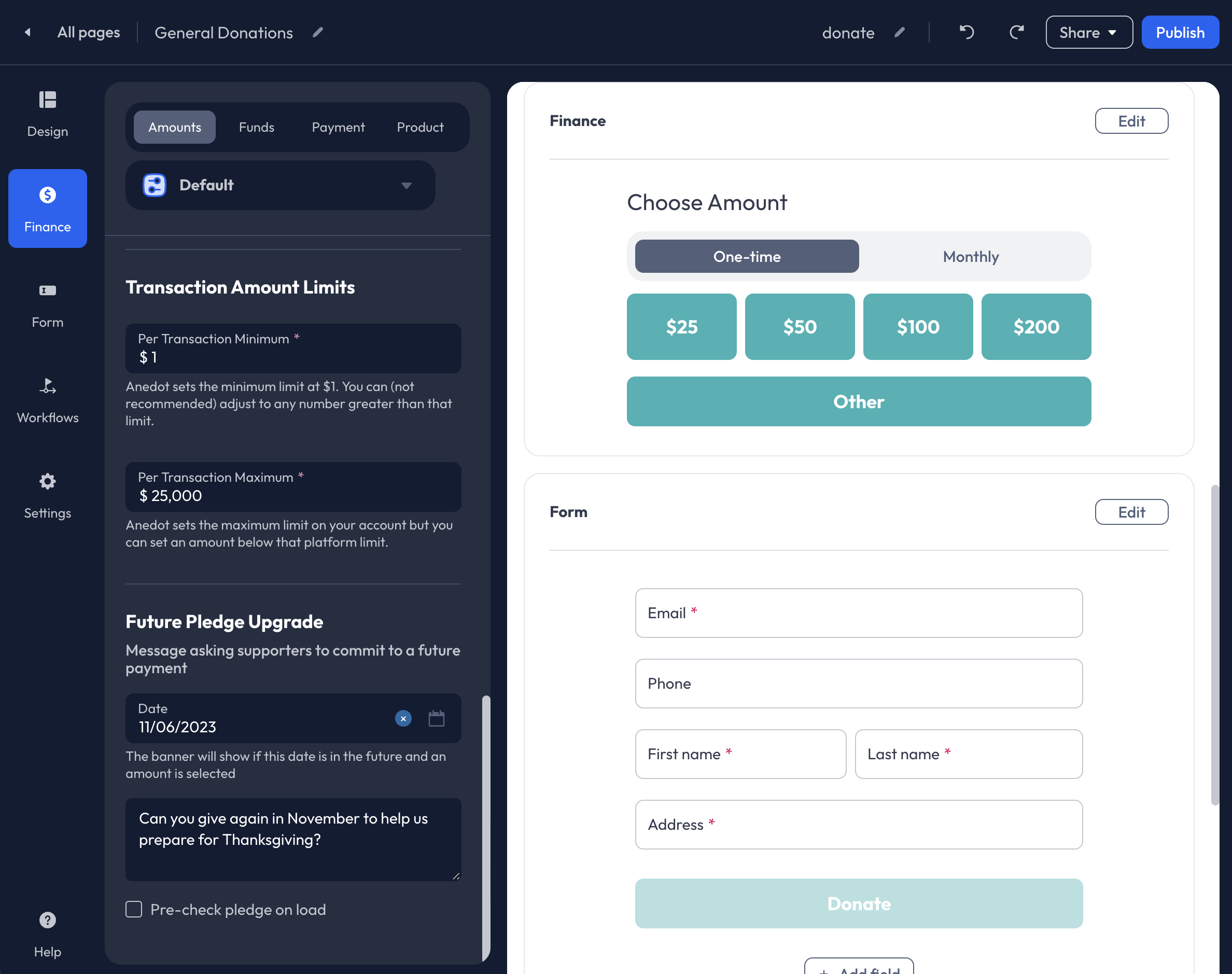
Under Transaction Amounts Limits, adjust the Per Transaction Minimum and Per Transaction Maximum. By default, the Per Transaction Minimum is set to $1 for all Donation Pages, and the Per Transaction Maximum is set to $25,000. To accept donations above $25,000, please contact our Support team here.
Settings a Per Transaction Maximum does not prevent a supporter from submitting multiple transactions over the Per Transaction Maximum.
Future Pledge Upgrade

Allow donors to make a future pledge by adding a Date and a call-to-action Message to the Future Pledge Upgrade field.
When a donor opts into the Future Pledge Upgrade, a donation will be processed at the time of the submission, and their pledged donation will be withdrawn on the future date set in the Action Page Builder. The donor will receive an email notification three days prior to the withdrawal.
Once the Date set for the Future Pledge Upgrade has passed, the option to make a future pledge will be removed from the public donation page. If needed, you can reset the Date within the Finance>Amounts tab of the Builder.
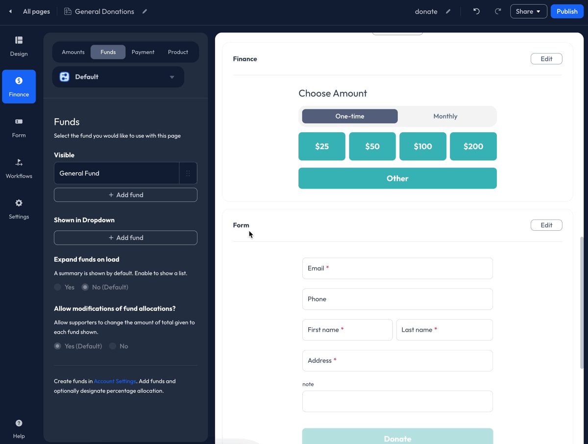
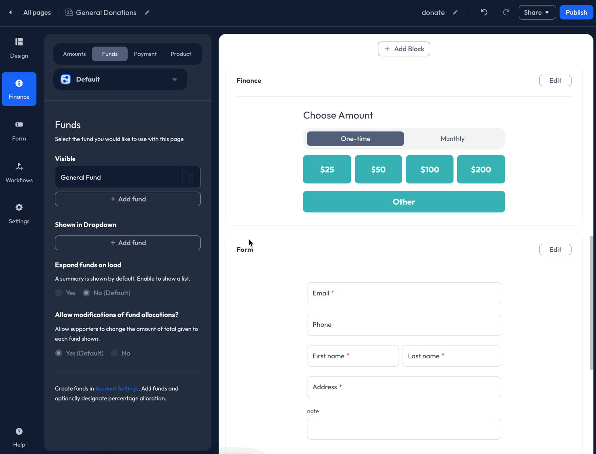
Funds

By default, the General Fund is connected to all Donation Pages. Within the Finance>Funds tab of the Builder, you may replace the General Fund with a new Fund, or connect multiple Funds to a single Donation Page.
Add Funds
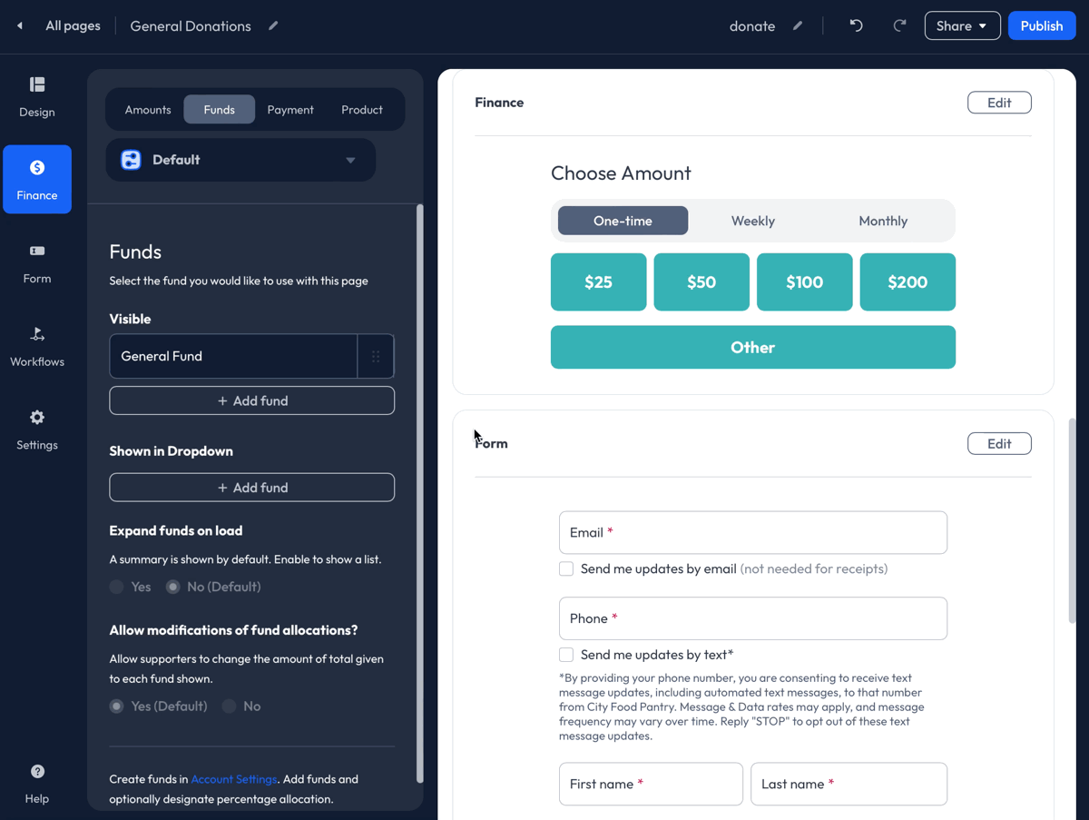
To add a Fund, click the + Add fund button under Visible or Shown in Dropdown. Continue to the steps below to learn more!
If a single Fund is attached to the Donation Page, the single Fund can only be placed under Visible.
Create a Fund
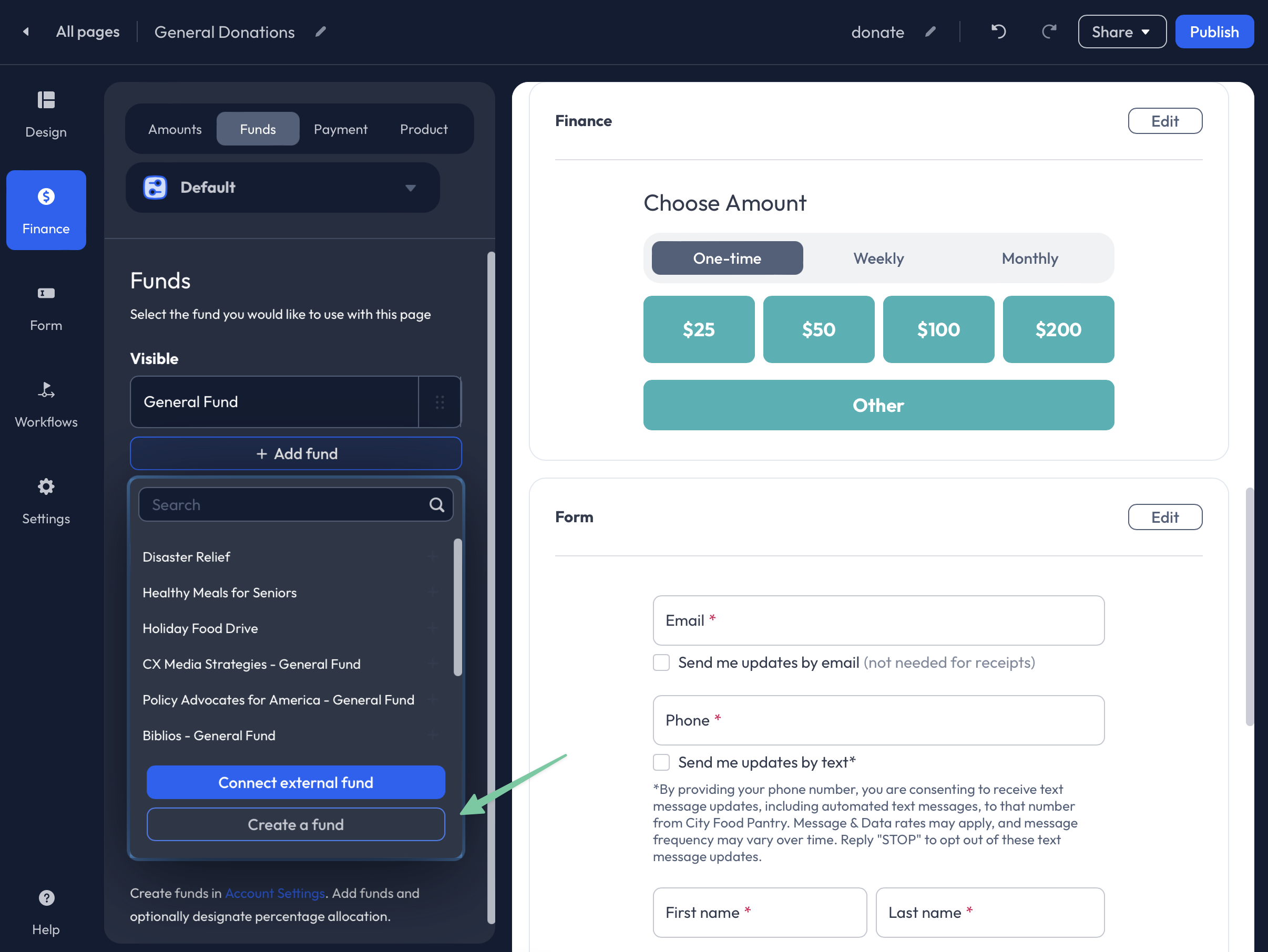 To create a new Fund, click the + Add fund button under Visible or Shown in Dropdown. Next, select the Create a Fund button. You will then be redirected to the Settings>Finance>Funds tab.
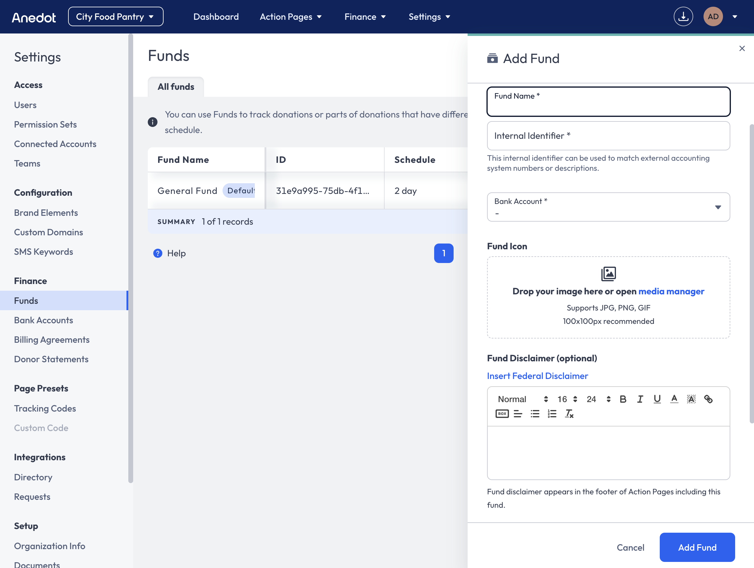
Within the Settings>Finance>Funds tab, click the blue Add Fund button in the upper right corner. Next, enter a Fund Name, an Internal Identifier, and connect a Bank Account. Click Add Fund in the lower right corner to complete the Fund creation.
Once your new Fund has been created, return to the Donation Page Builder. Within the Finance>Funds tab, click the + Add fund button under Visible or Shown in Dropdown to connect the new Fund.
Connect an External Fund
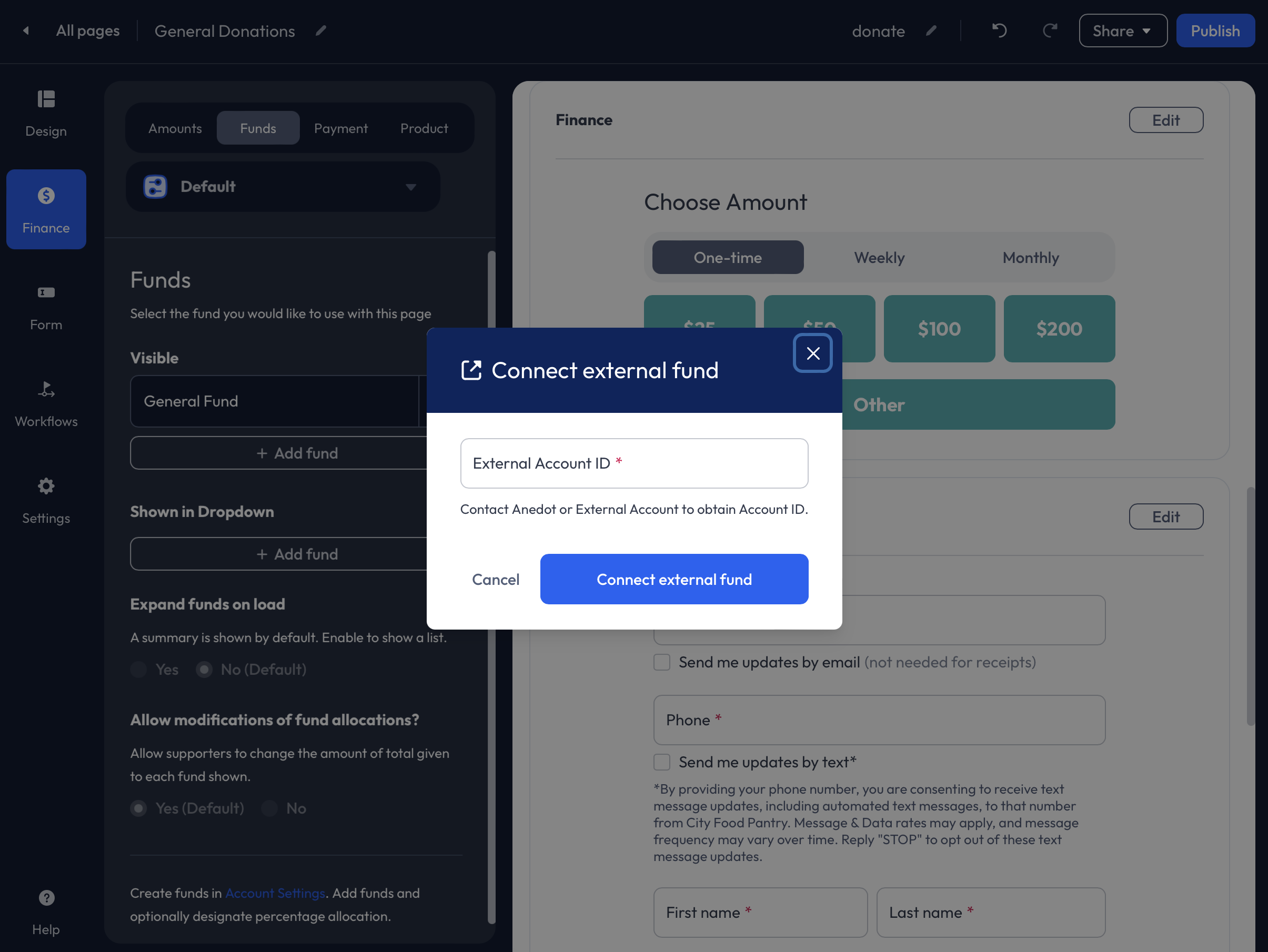
Connect an external fund from another organization to create a Tandem Donation Page. To learn more about Tandem Donation Pages, click here!
Before successfully connecting an external Fund, you will need to request the Anedot Account UID from the organization you want to connect with. The Account UID for any account can always be found in the Account URL when logged in.

To connect an external Fund, click the + Add fund button under Visible or Shown in Dropdown. Next, click the Connect external fund button. In the External Account ID field, enter the other organization's Account UID. Click Connect external fund.
Next, click the + Add fund button under Visible or Shown in Dropdown and select the connected external Fund from the dropdown list.
Visible
When multiple Funds are placed under Visible, the Funds will appear under the Preset Buttons on the donation form. Optionally, you may add Percentages to automatically split the donation amount between Funds. The percentage must equal 100%.
Shown in Dropdown
When multiple Funds are placed under Shown in Dropdown, the Funds will not be shown on the donation form unless the donor manually adds the Fund to their donation selection.
Expand funds on load
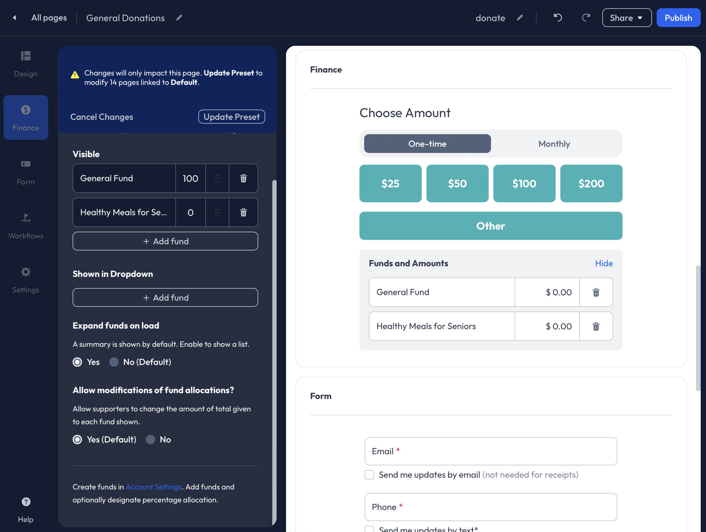
Funds are not expanded by default. When multiple Funds have been added under Visible, you may optionally expand the Funds on load. This will allow donors to view the percentage splits. Funds cannot be expanded upon load when Funds are placed under Shown in Dropdown.
Allow modifications of fund allocations?
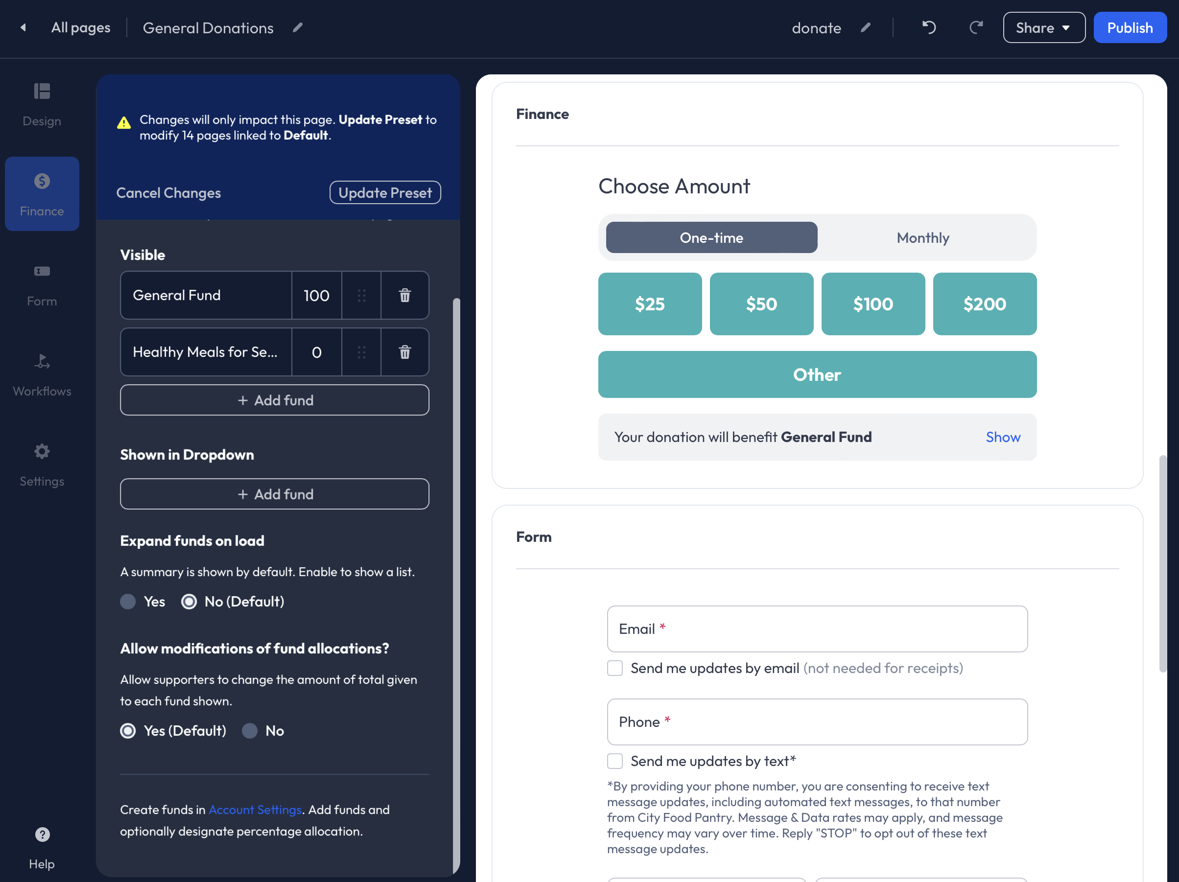 When Funds are placed under Visible, donors can adjust the donation amount for each Fund. You may optionally disable this feature, preventing donors from manually adjusting the Fund splits.
Payment
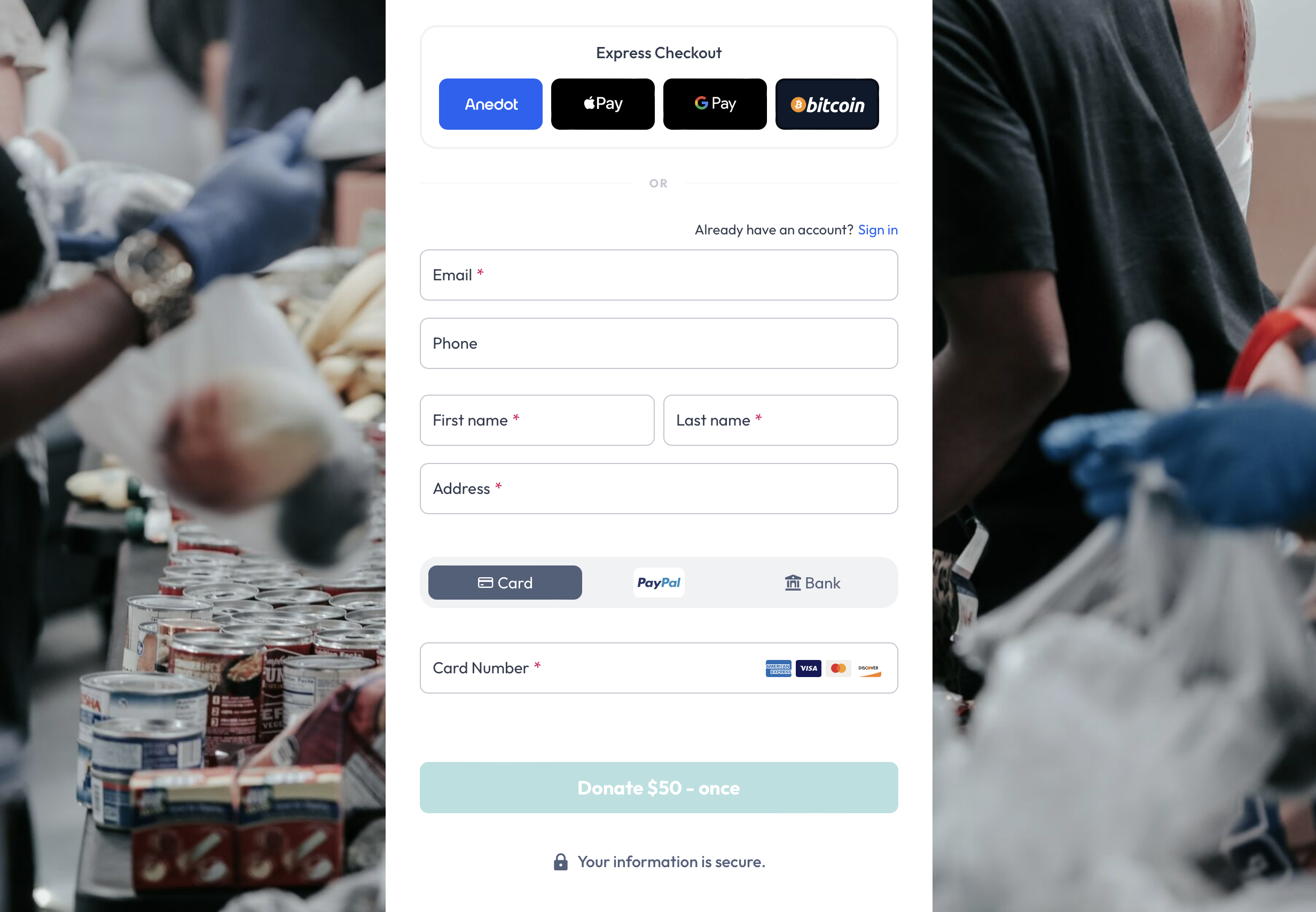
Within the Finance>Payment tab, you may adjust the Payment Methods available, along with the Donor Covers Fee feature settings.
Payment Methods
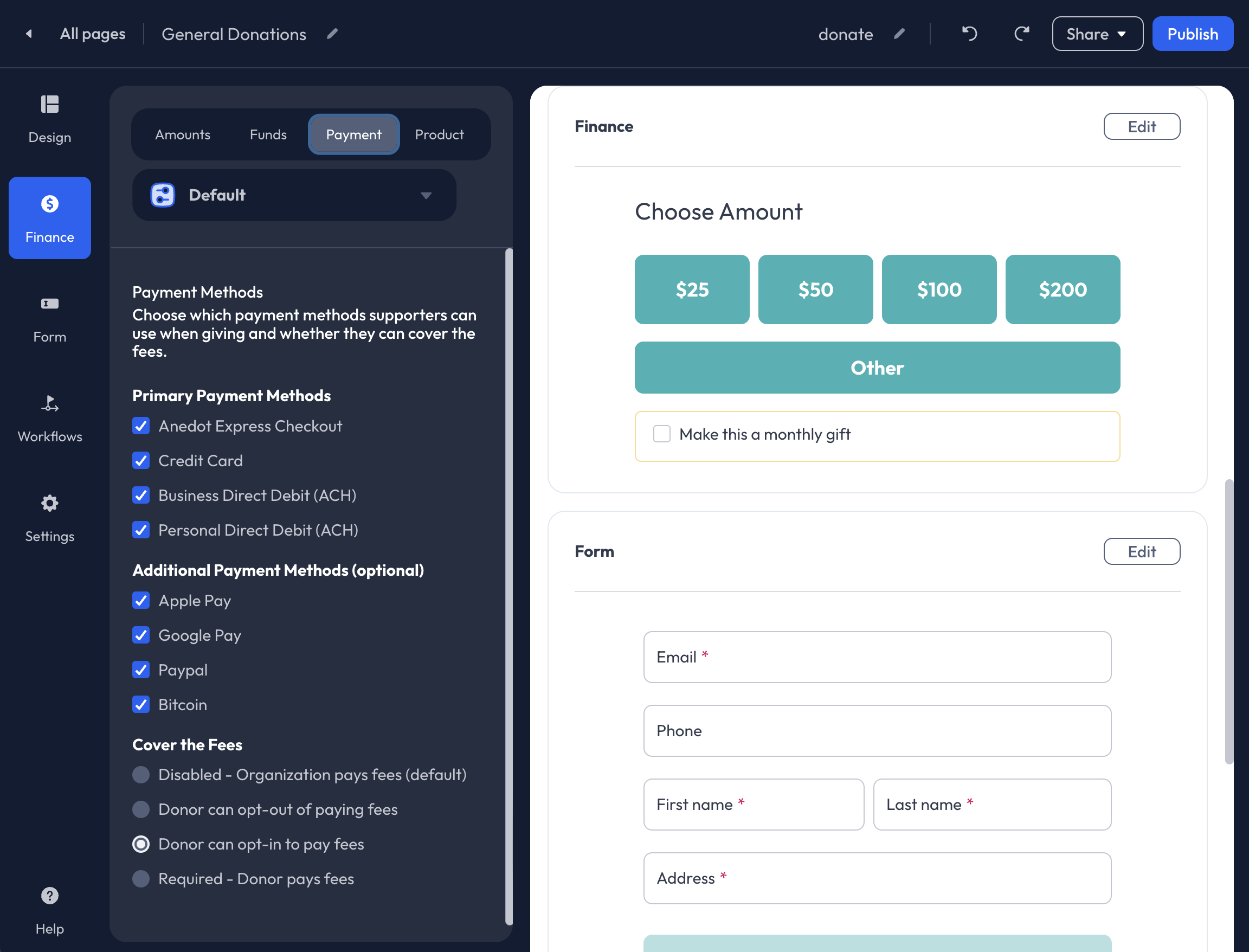
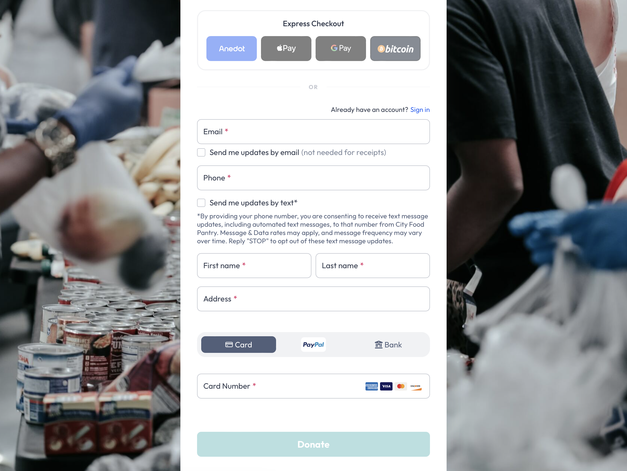
The following payment methods are available for Donation Pages:
- Anedot Express Checkout
- Credit Card
- Business Direct Debit (ACH)
- Personal Direct Debit (ACH)
- Apple Pay
- Google Pay
- PayPal
- Bitcoin
To remove a payment method type from your Donation Page, uncheck the box to the left of the listed payment method.
Anedot Express Checkout allows donors who have a DonorID to use their saved payment method for a faster checkout experience. This option will appear as a blue Anedot button under Express Checkout. If disabled, donors who would prefer to donate by logging in to their DonorID will be able to use the blue Sign In hyperlink to log in successfully. A DonorID is not required to submit a successful donation through Anedot Donation Pages.
If you would like to enable Bitcoin as a payment method for your Donation Pages, please contact our Support team here.
Donor Covers Fees
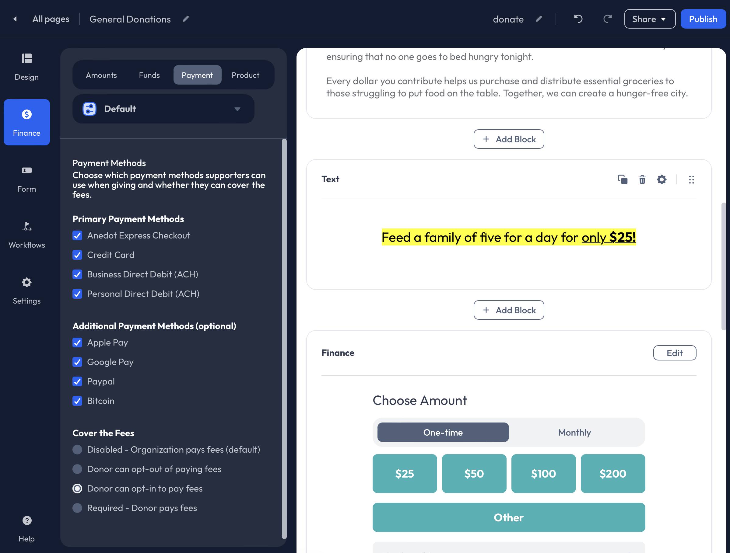
The Donor Covers Fees feature allows donors to increase their total donation amount to cover the processing fee associated with their donation. This allows the organization to receive the total intended gift amount. Click here to learn more about the Donor Covers Fees feature!
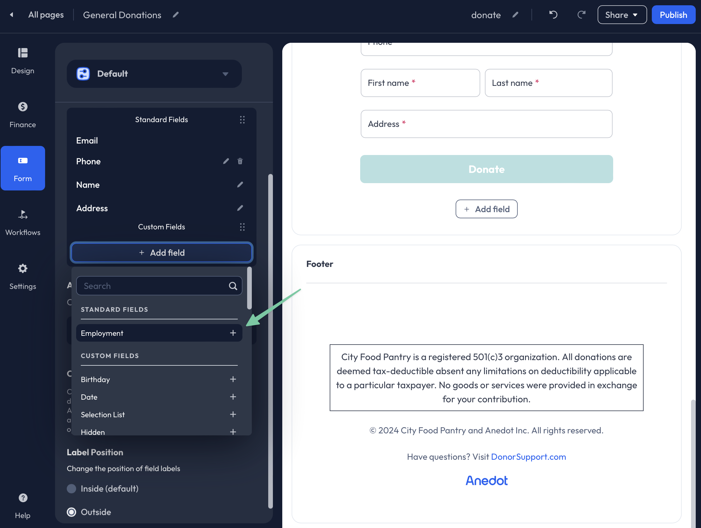
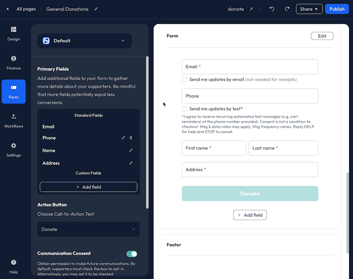
Form
Access the Form tab within the Builder to customize the data you would like to retrieve from supporters.
The following data fields are available:
- Email (required by default)
- Phone
- Name (and Organizations) (required by default)
- Address (required by default)
- Employment
- Birthday
- Date
- Selection List
- Hidden
- Question
- Text
- Requirement
Email
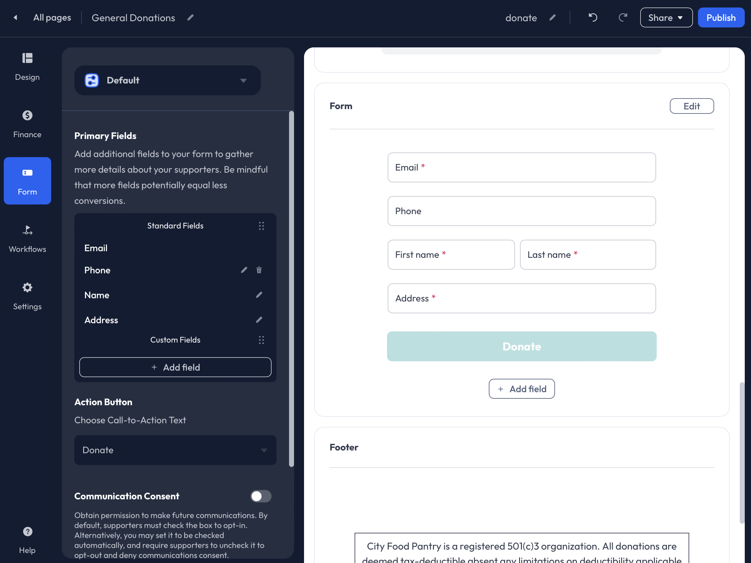
The Email field is required by default and cannot be disabled. This field is used to send donors the Email Receipt for their successful submission.
Phone
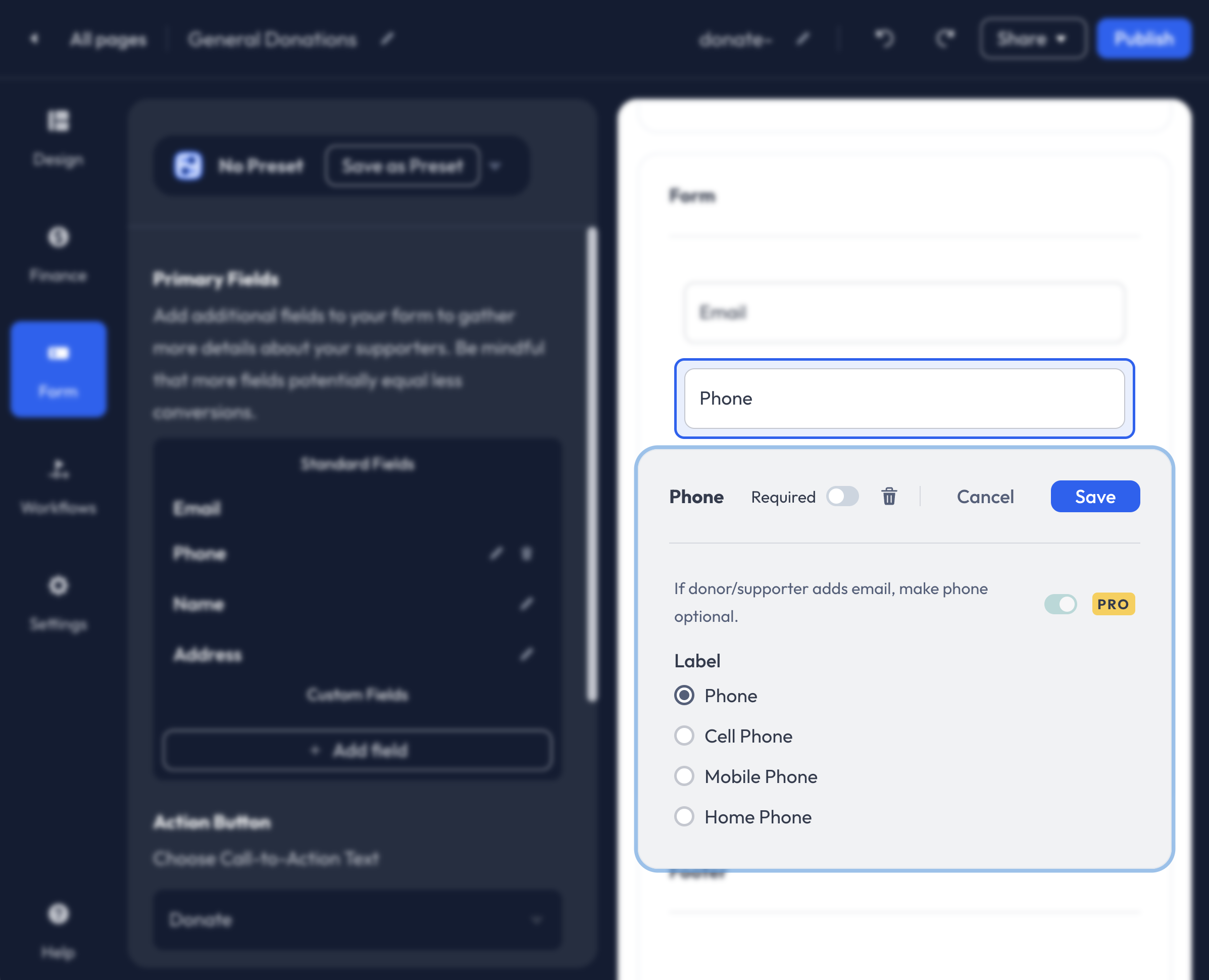
The Phone field can be added as an Optional or Required field. To set it as required, be sure to enable the Required toggle.
The following Phone field labels are available:
- Phone (Default)
- Cell Phone
- Mobile Phone
- Home Phone
When Pro has been enabled on a fundraising account, the option to allow a supporter to enter either their Email or Phone becomes available. This allows the donor to provide a Phone Number instead of an Email which is typically a required field. If an Email is not provided, the donor will not receive an Email Receipt for their donation.
Please contact our Support team here to request Pro access.
Name (and Organizations)
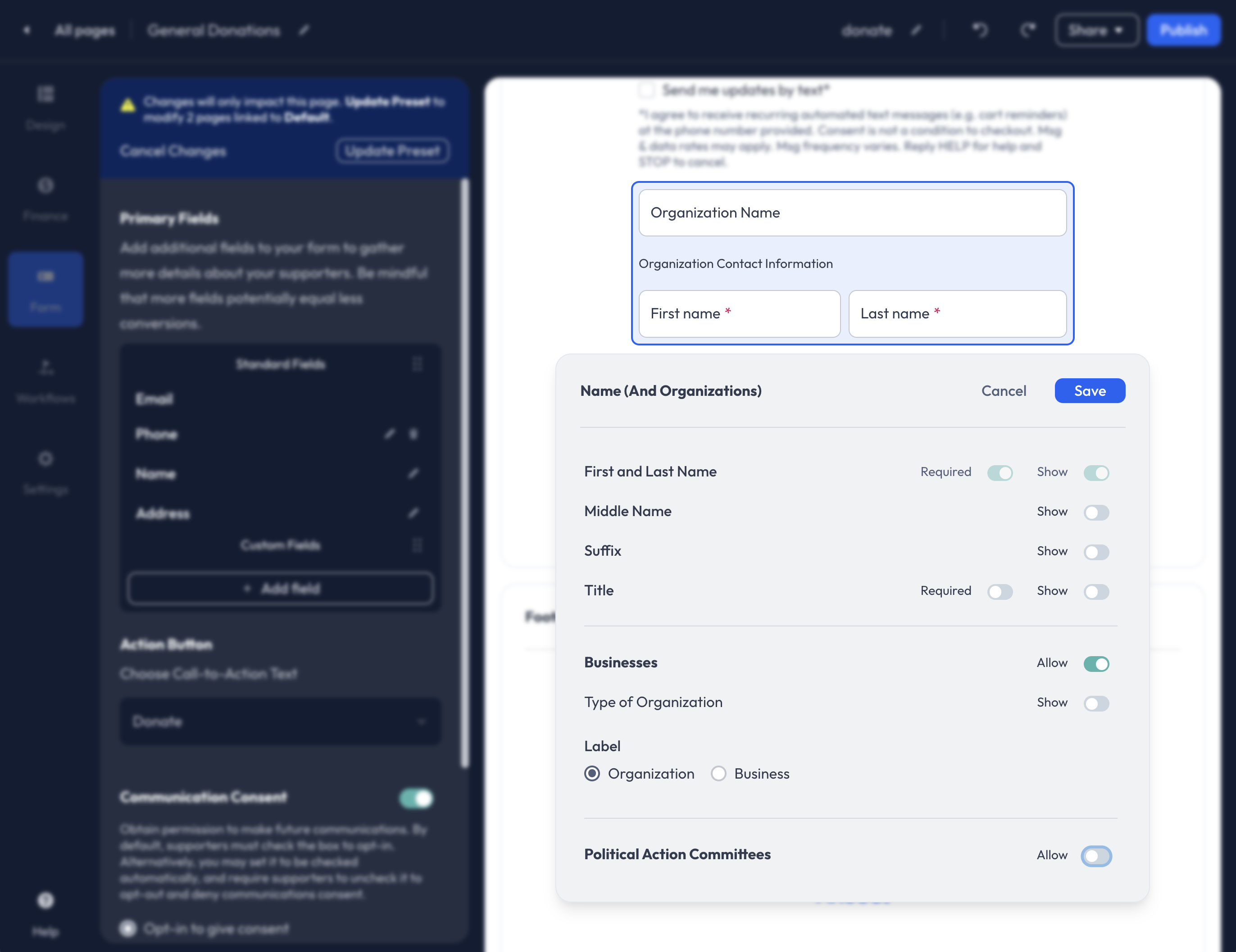
Within the Name field editor, you can enable and customize the following fields:
- First and Last Name (required)
- Middle Name
- Suffix
- Title
- Organization/Business
- Political Action Committees
Address
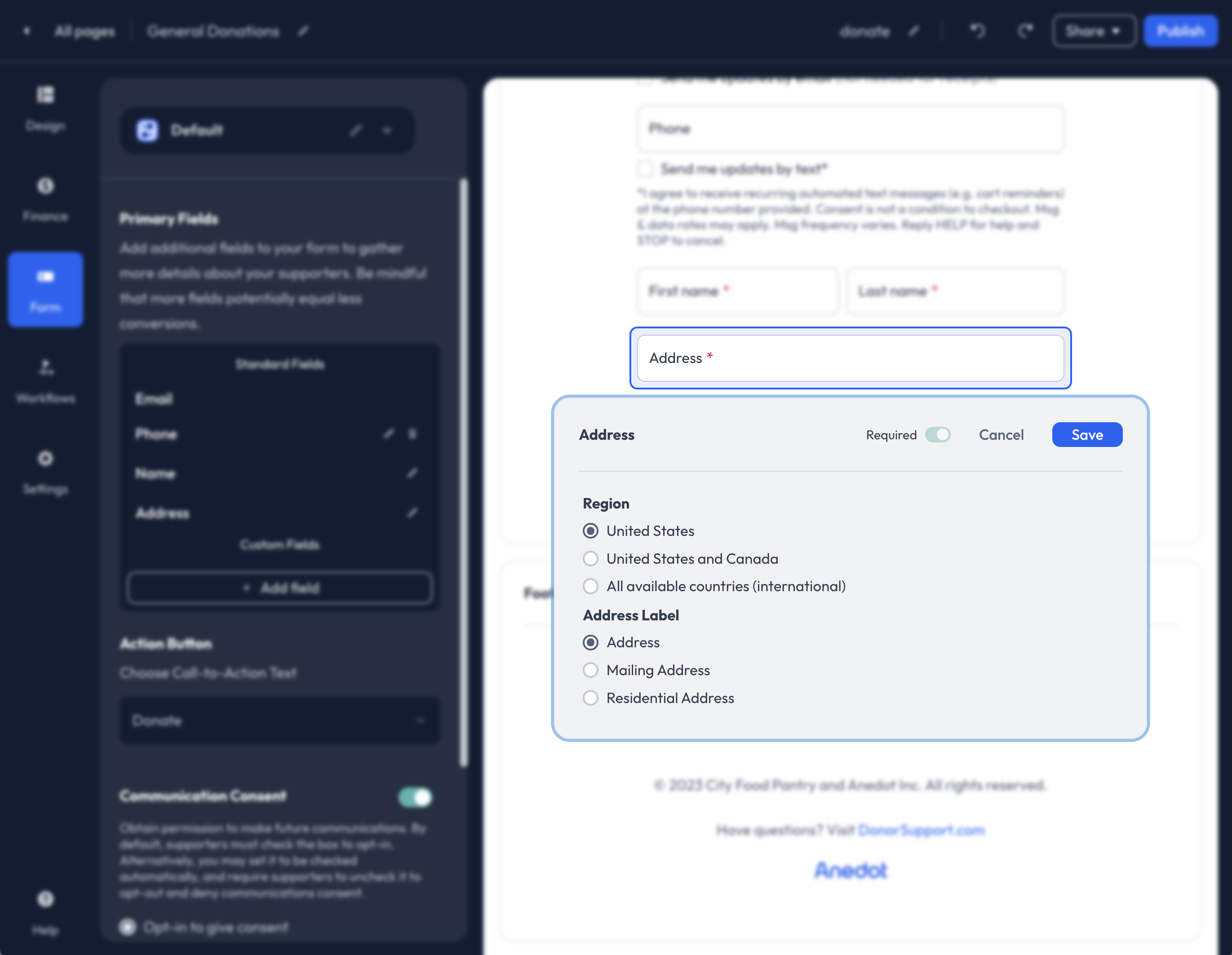
Within the Address field editor, you can enable International donations and adjust the Address Label.
The following Address Labels are available:
- Address
- Mailing Address
- Residential Address
- Shipping Address
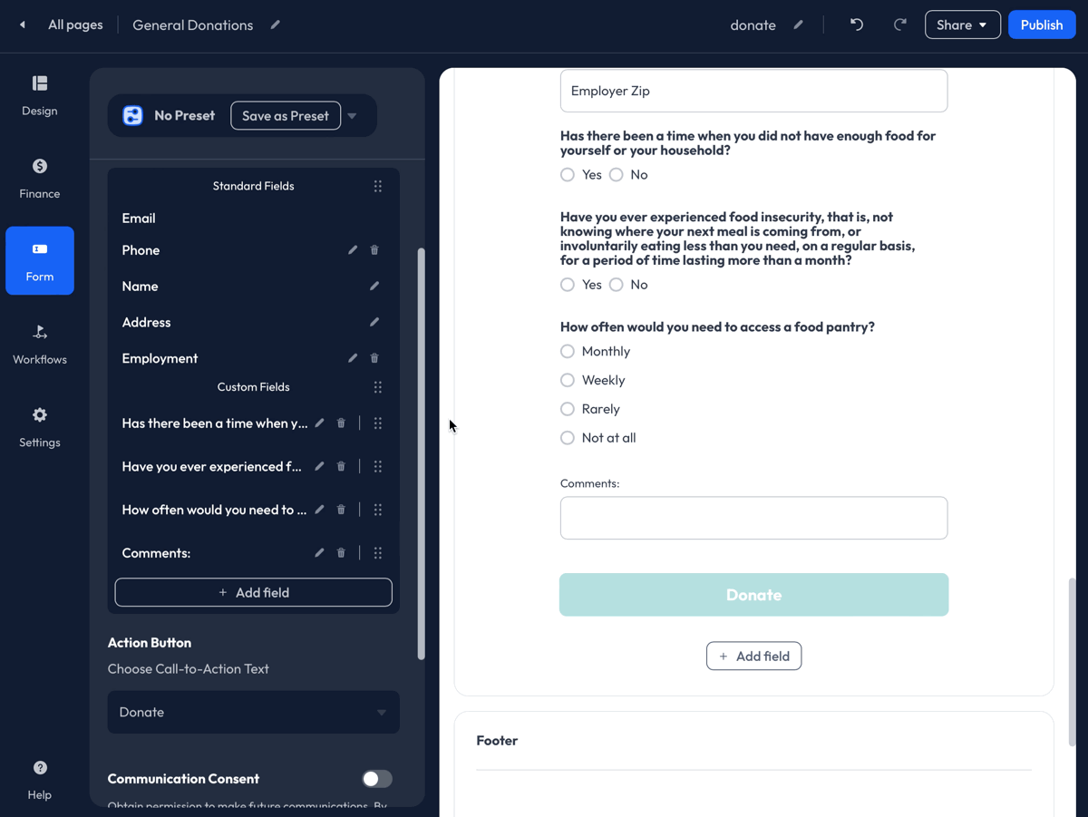
Employment
Collect Employment data by enabling Occupation, Employer Name, and Employer Address.
To ensure a response is collected for each successful submission, enable the Required toggle for each field added to the Donation Page.
When Occupation and Employer Name are enabled, the following question is automatically added to the page, "Are you currently employed?" Donors can select Yes or No.
If No is selected, the following options will be available in a dropdown menu:
- Unemployed
- Homemaker
- Retired
- Student
Occupation
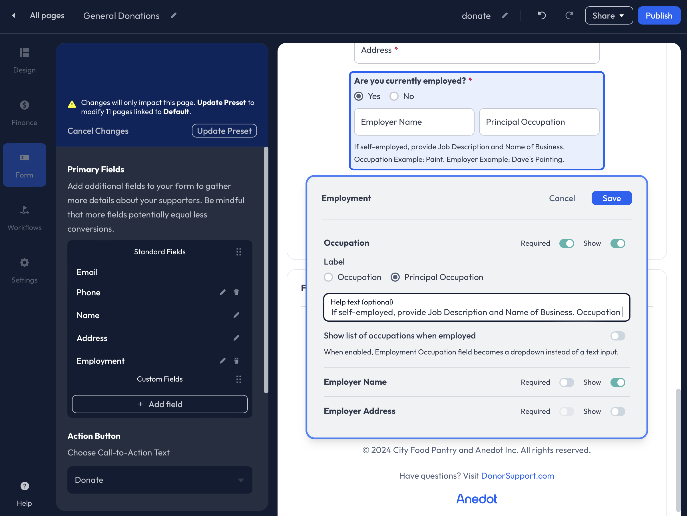
When the Occupation field is enabled, you can choose one of the following field labels:
- Occupation
- Principal Occupation
Additionally, a Help Text field is available to enter a custom message or prompt.
When Show list of occupations when employed is enabled, you may add a list of Occupations you would like donors to select from.
Employer Name
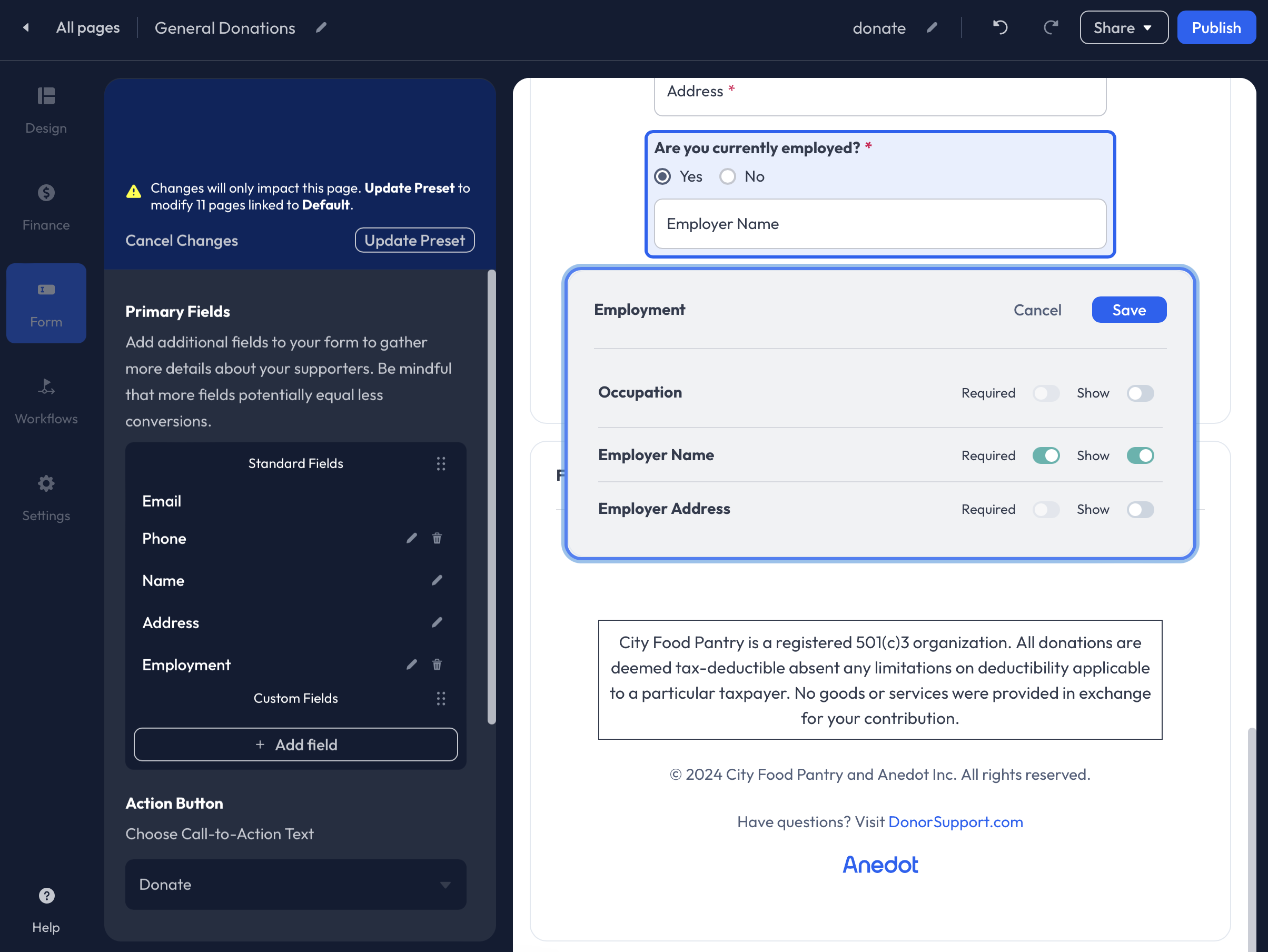
The Employer Name field can be Shown and set as Optional or Required.
Employer Address
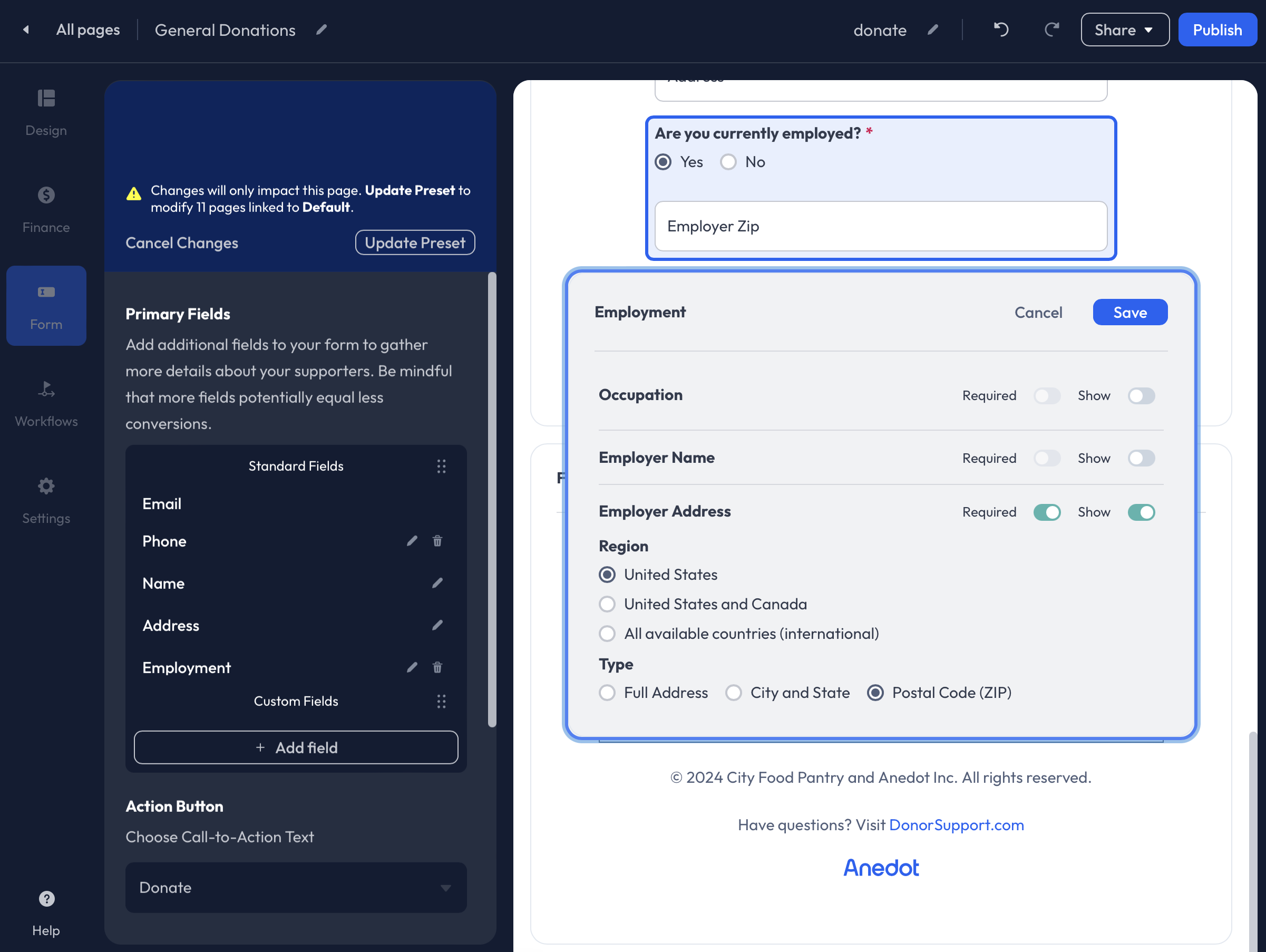
The Employer Address field can be Shown and set as Optional or Required.
Additionally, you can adjust the Region and Type of address.
The following Regions are available:
- United States
- United States and Canada
- All available countries (international)
The following Types are available:
- Full Address
- City and State
- Postal Code (ZIP)
Selection List
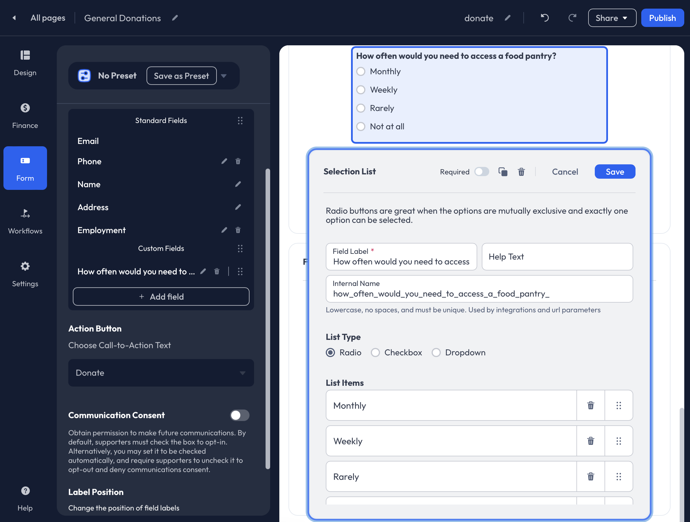
With the Selection List field, add custom questions to your form with preset responses using Radio, Checkbox, or Dropdown as the list type.
Radio will display the response options in a bubble format and allow for a single selection.
Checkbox will display the response options in a checkbox format and will allow multiple selections.
Dropdown will display the response options in a dropdown list, only allowing a single selection.
Hidden
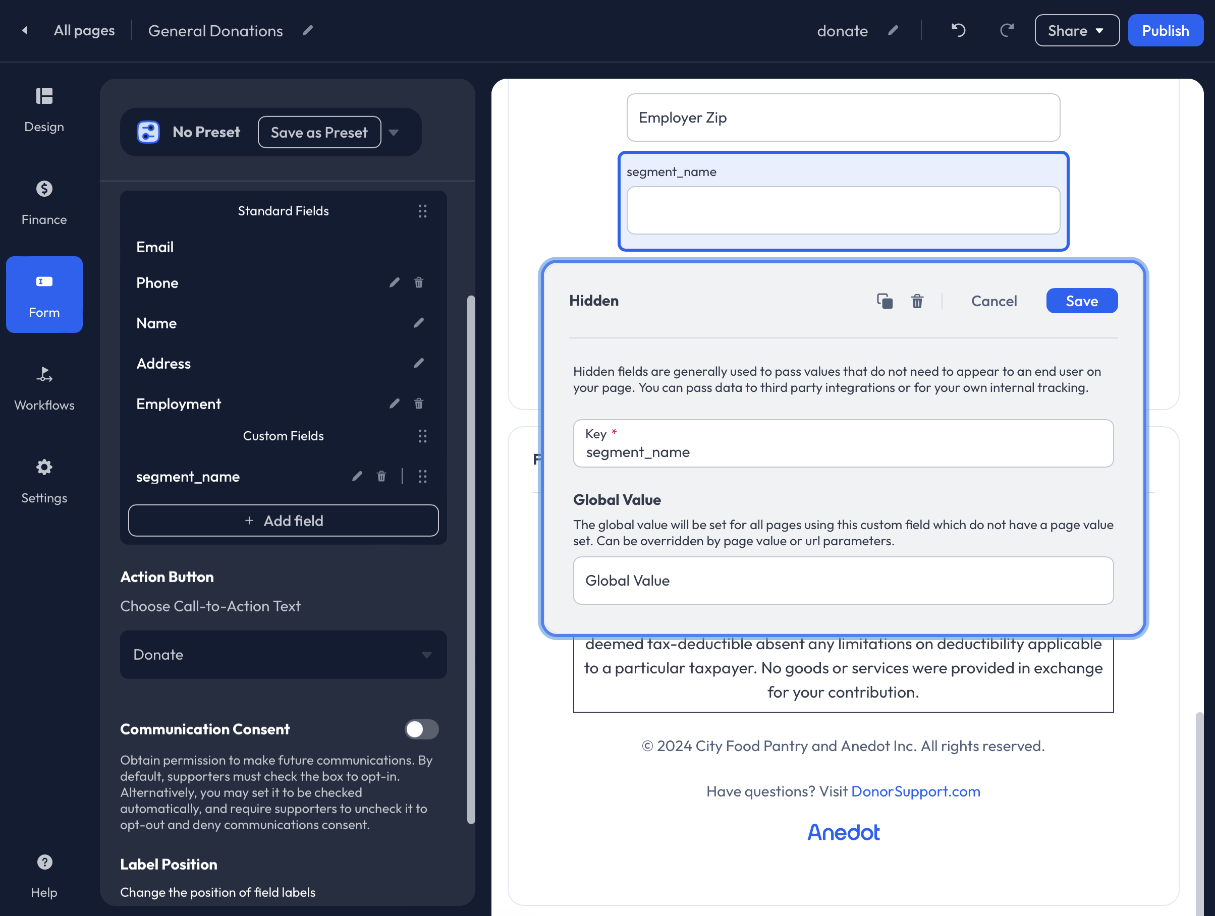
Hidden fields can be used to pass hidden values for successful submissions. The hidden field values can be passed to your third-party integrations or be used for internal tracking purposes.
When creating a Hidden field, be sure to apply a custom Key. The Key must be unique. If you have previously set up a Hidden field with a unique Key, access the Account Fields from the Custom Field list to reuse the existing field. You will receive an error if you attempt to set up a duplicate Hidden field with the same Key.
Setting a Global Value is optional. If a Global Value is entered, it will be used for all submissions made through the page to which the field has been applied.
To use the Key across multiple pages but pass a unique value per page, set a unique Page Value by accessing the Settings>Sharing>Page Specific Values tab in the Builder.
A Page Value or URL Parameter can override the Global Value.
Question
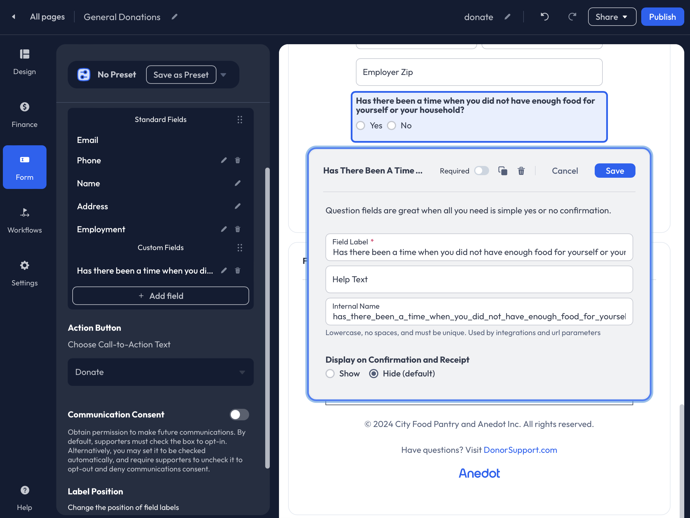
The Question field allows you to ask your supporters a question and receive a Yes or No response.
Within the CSV Export, Yes or No responses will be recorded as True or False.
Text
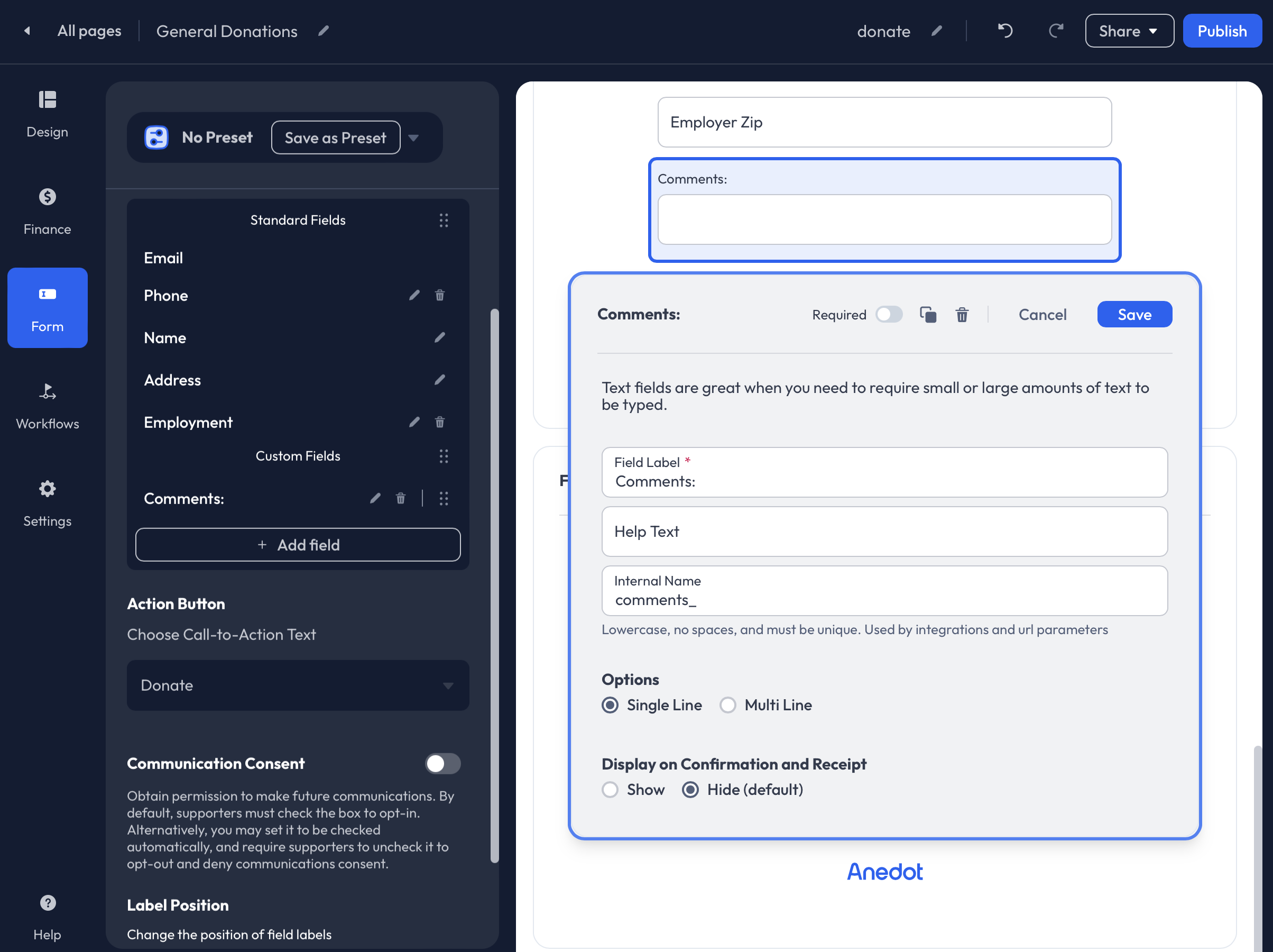
The Text fields allow supporters to enter a custom response that is unique to them.
Requirement
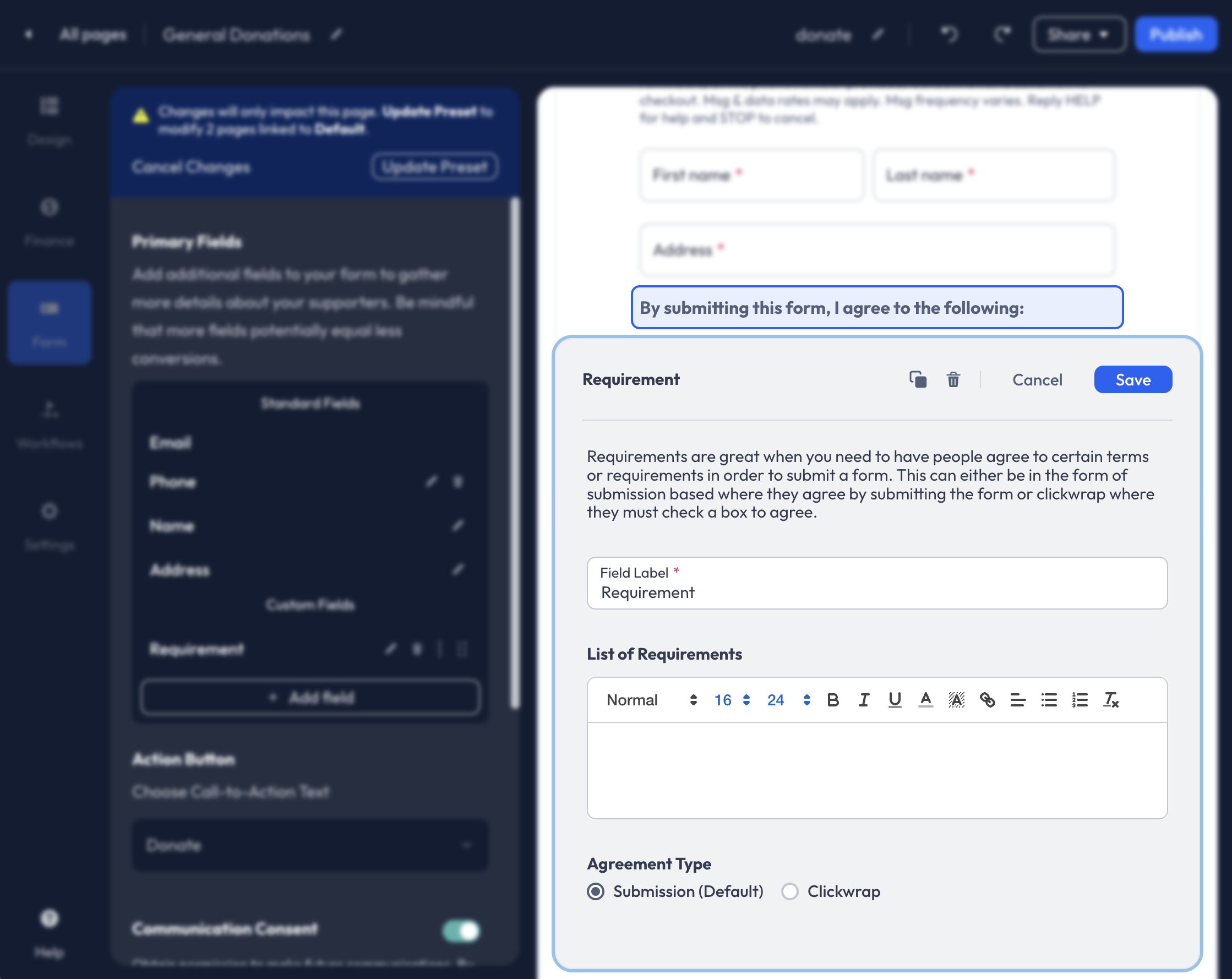
The Requirement field may be used for Legal Terms or consent from your supporters. 'By submitting this form, I agree to the following:’ will be titled above your Field Label and List of Requirements.
To add a Checkbox to the field, select Clickwrap as the Agreement Type.
Account Fields
Every custom field added to your Action Pages is saved as an Account Field. These fields can be used again for future pages, preventing the need to create a new custom field.
To access Account Fields, click the + Add Field within the Form tab of the Builder, then scroll down to past the custom field types. You will receive an error message if you attempt to create a duplicate custom field that is already available in your list of Account Fields.
If you'd like to continue creating a duplicate custom field, you will need to alter the field's Internal Name.
Communication Consent
Enable Communication Consent to obtain permission to make future communications with your supporters.
By default, supporters must check the box to opt in. You may optionally pre-check the fields, allowing donors to opt out manually.
Allowing your supporters to opt-in to receive communications from your organization builds trust with your donors.
Reorder Fields
For Donation Pages, Custom Fields can be re-ordered, but Standard Fields are stagnant and cannot be adjusted.
To adjust the order of your fields, hover over the Custom Field and click the Tile icon to the right of the individual field. The field can be maneuvered above or below other Custom Fields. If the Tile icon is unavailable, the field cannot be re-ordered.
Workflows
Access the Workflows tab within the Builder to enable Upgrades, Recovery (Abandoned Actions), and customize Receipts.
Upgrades
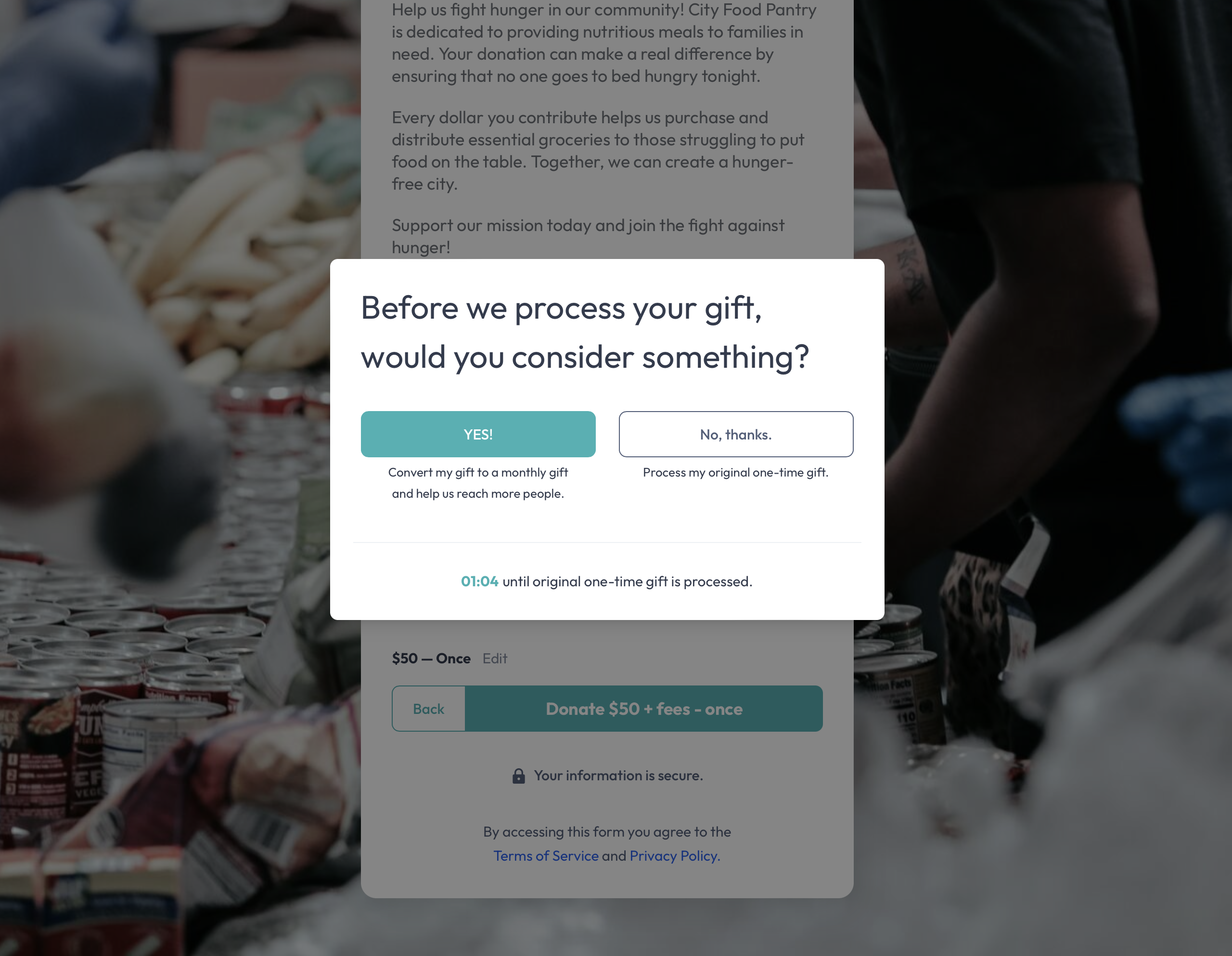
The Upgrades feature enables organizations to encourage recurring gifts and support for additional fundraising efforts by applying Pre-conversion and Post-conversion Upgrades to their Donation Pages.
With Pre-conversion Upgrades, you can ask your supporters to commit to a monthly donation for a percentage of their initial one-time gift before making a successful submission.
Post-conversion Upgrades allow you to redirect your supporters to another Action Page after they have made their initial submission.
Pre-conversion Upgrades
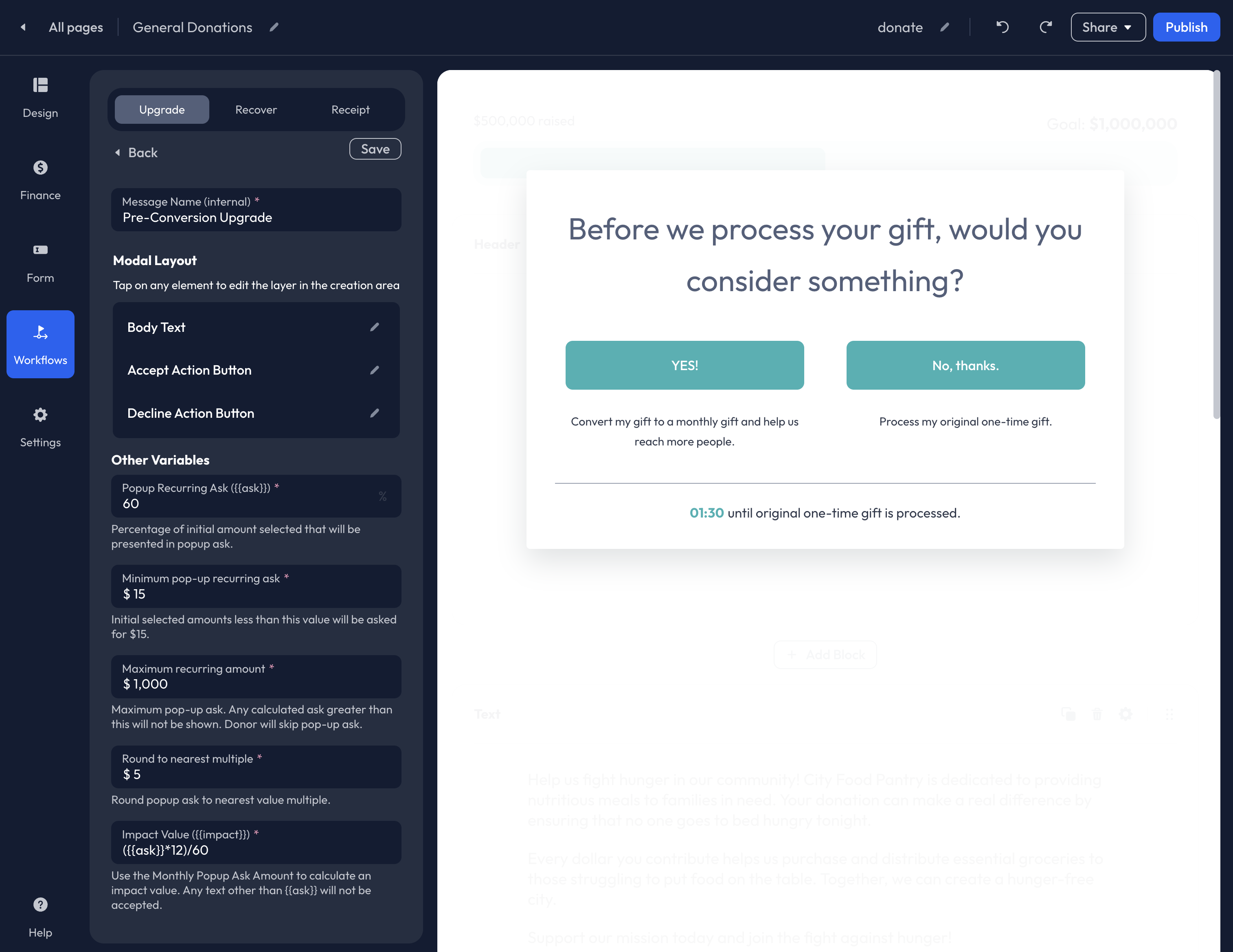
To get started creating a Pre-conversion Upgrades, click Add pre-conversion recurring from the Upgrade Workflow list, then click + Create New.
You will be redirected to the Pre-conversion Upgrade editor where you can customize the Body Text, Accept Action Button, Decline Action Button, and Variables.
For recurring upgrades, we recommend customizing the Accept and Decline Action Button Text fields to reaffirm the donor's opt-in before making a selection.
Popup Recurring Ask ({ask}): This is the percentage of the initial amount selected by the donor that will be presented in the popup ask as a monthly commitment.
Minimum pop-up recurring ask: This field allows you to set a minimum recurring commitment amount. This is helpful when donors give smaller dollar donations in their original submission.
Maximum recurring amount: Set a maximum recurring amount. Any calculated ask greater than this set amount will not be shown. Donors whose donation amount exceeds the Maximum recurring amount will not be shown the recurring upgrade. Their one-time donation will be processed successfully upon submission.
Round to nearest multiple: Rounds the popup ask to the nearest value multiple.
Impact Value ({impact}): Use the Popup Recurring Ask amount to calculate an impact value.
Variable Tags: Utilize the following Variable Tags to customize the Upgrade Message for each donor experience:
{first_name}{last_name}{ask}{impact}
When you have completed your edits, be sure to click Save at the top of the Pre-conversion Upgrade Editor. Once saved, you will return to the Upgrade tab. Next, click Add pre-conversion recurring from the Upgrade Workflow list, then select your new Pre-conversion Upgrade from the dropdown list. Before exiting the Builder, click Publish in the upper right corner.
Post-conversion Upgrade
With Post-conversion Upgrades, you can redirect your supporters to one or many additional Action Pages after their initial submission. Before getting started, you will first need to create the individual Action Page(s) you would like supporters directed to.
If a Recovery Message is enabled on an Action Page you plan to connect as a Post-Conversion Upgrade, the Recovery Message will not be triggered on the Upgrade.
Once you have built the Action Page(s), return to the Workflows>Upgrade tab within the Builder to set up your Post-conversion Upgrade.
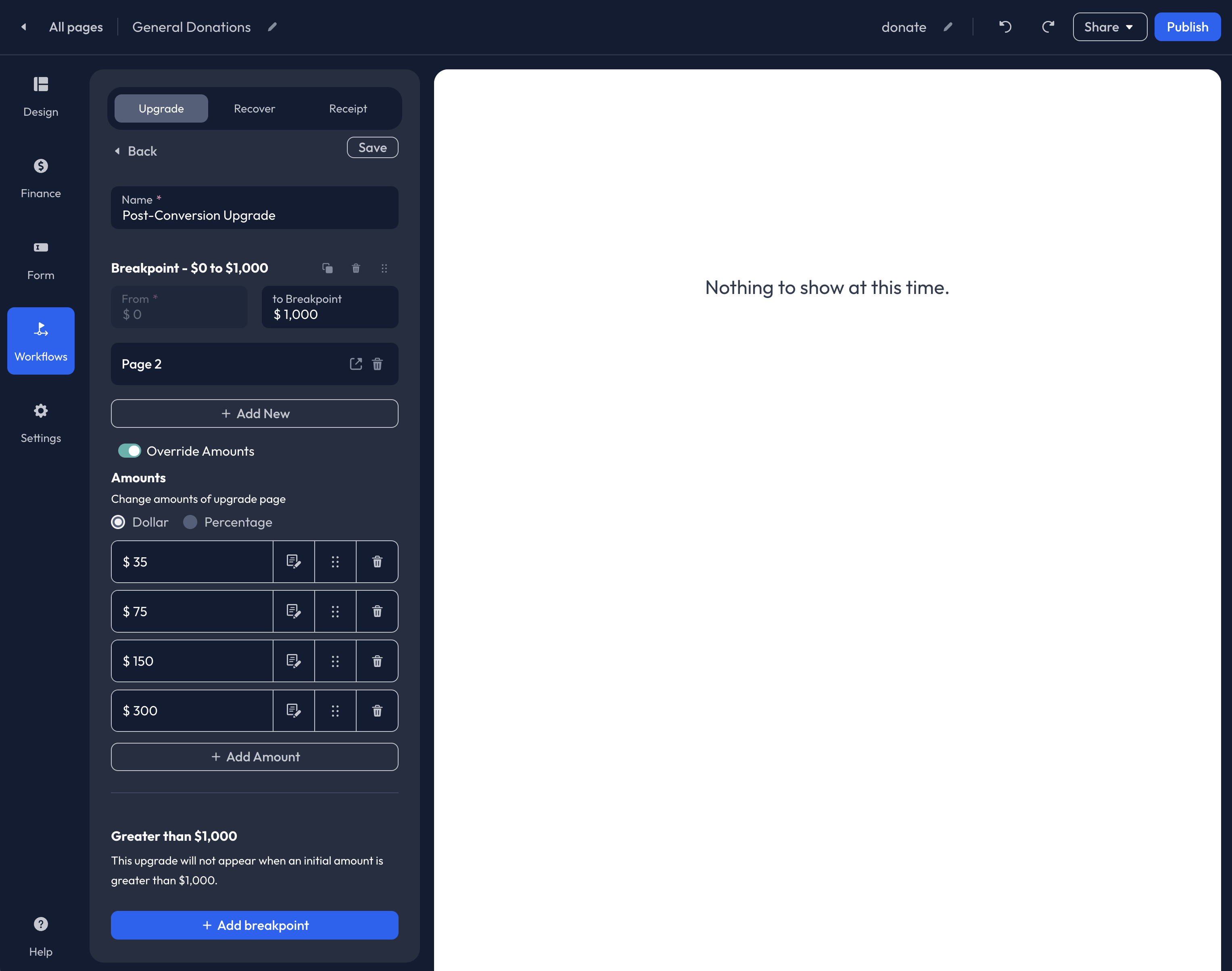
To connect a Post-Conversion Upgrade, select Add post-conversion upgrade, then Click + Create New. You will then be redirected to the Post-Conversion Upgrade editor where you can add a Name to the upgrade and set breakpoints.
Breakpoints allow you to determine which supporters are directed to the upgrade. The default breakpoint is set from $0 - $1,000. At this breakpoint, supporters who gave over $1,000 will not be shown the upgrade. You can adjust the breakpoints to fit your supporter base and needs.
Set up additional breakpoints by clicking the blue + Add Breakpoint button at the bottom of the editor. Supporters will be directed to the breakpoint that corresponds to their original submission amount.
To connect an Action Page(s) to the Post-conversion Upgrade, click + Add New. If multiple Action Pages are selected, they will appear in a grid format for your supporters.
To override the Preset Amounts listed on the Action Page(s) you have connected, click the Override Amounts toggle. An Amounts menu will appear where you can customize the Preset Amounts by Dollar or Percentage.
Click Save before exiting the Pre-conversion editor. You will then be redirected to the Upgrade tab. Next, click Add post-conversion recurring from the Upgrade Workflow list, then select your new Post-conversion Upgrade from the dropdown list. Before exiting the Builder, click Publish in the upper right corner.
Recovery (Abandoned Actions)
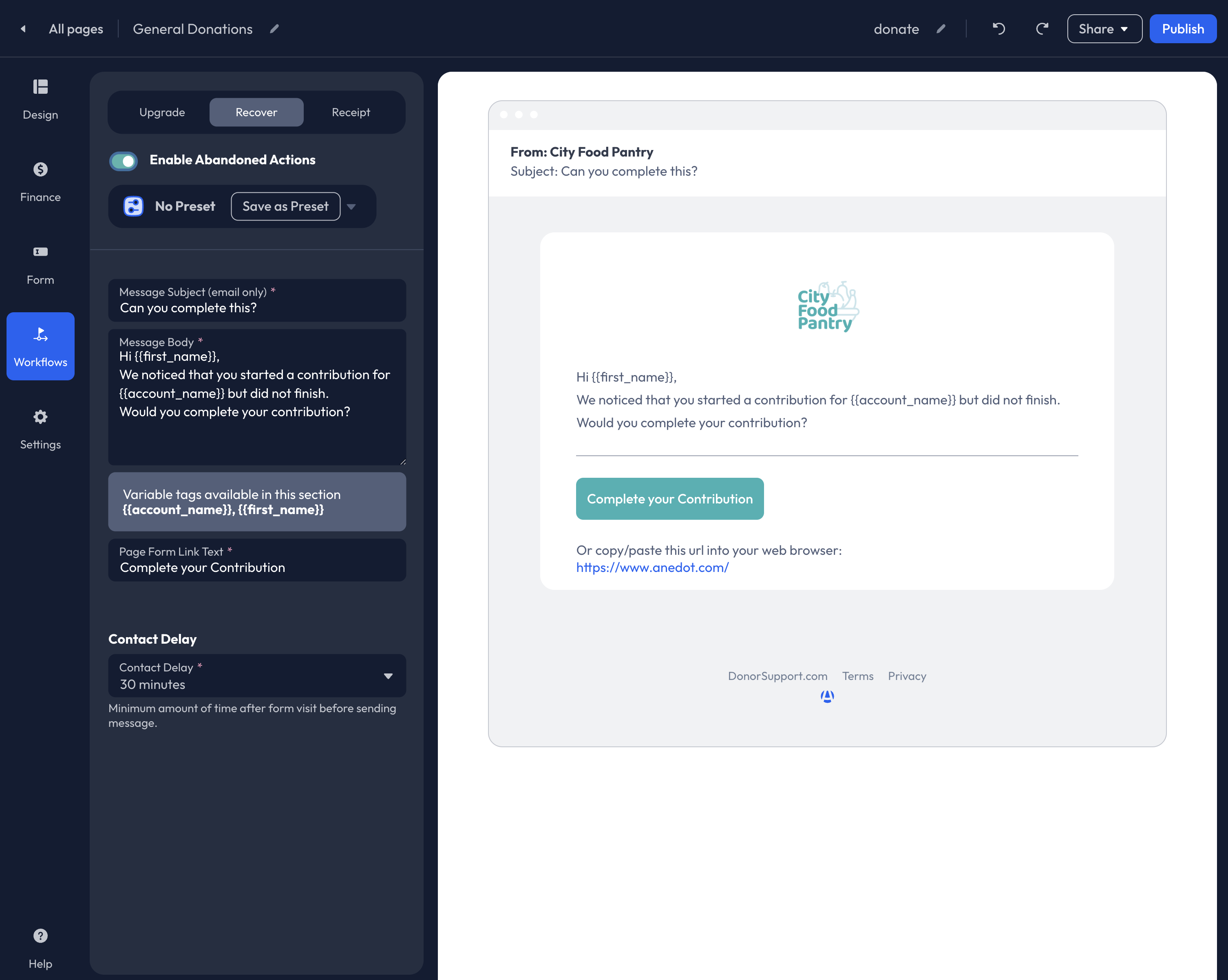
The Abandoned Actions feature automatically sends follow-up emails to supporters who were unable to successfully complete their donation. If a supporter enters their email address on your Donation Page but does not make a successful submission, a custom message will be sent to help recover the lost conversion.
Access the Workflows>Recover tab of the Builder, then click Enable Abandoned Actions to utilize Recovery Messages.
Once you have enabled the feature, customize the following:
- Message Subject (displayed as the email Subject line)
- Message Body
- Page Form Link Text (your donation link will be hyperlinked with this text)
- Contact Delay
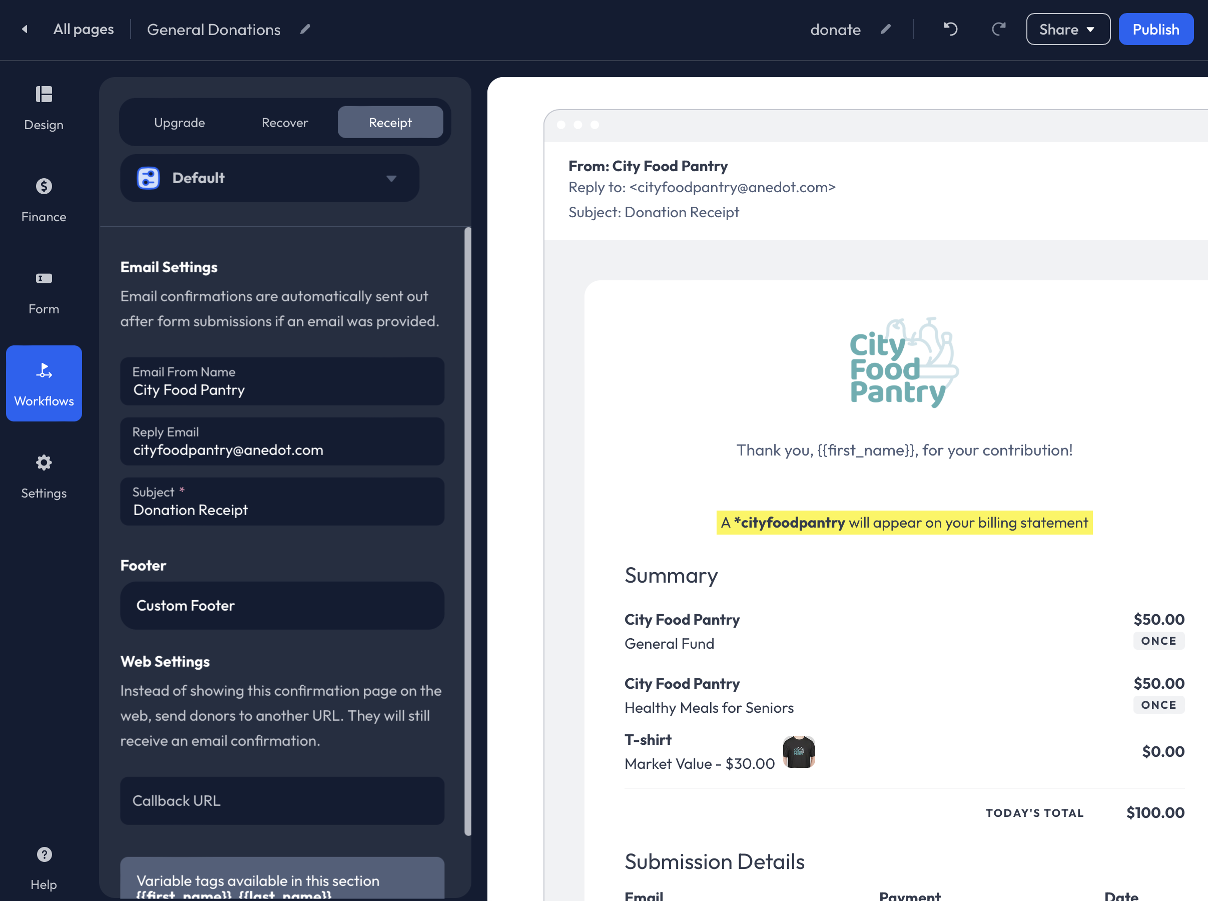
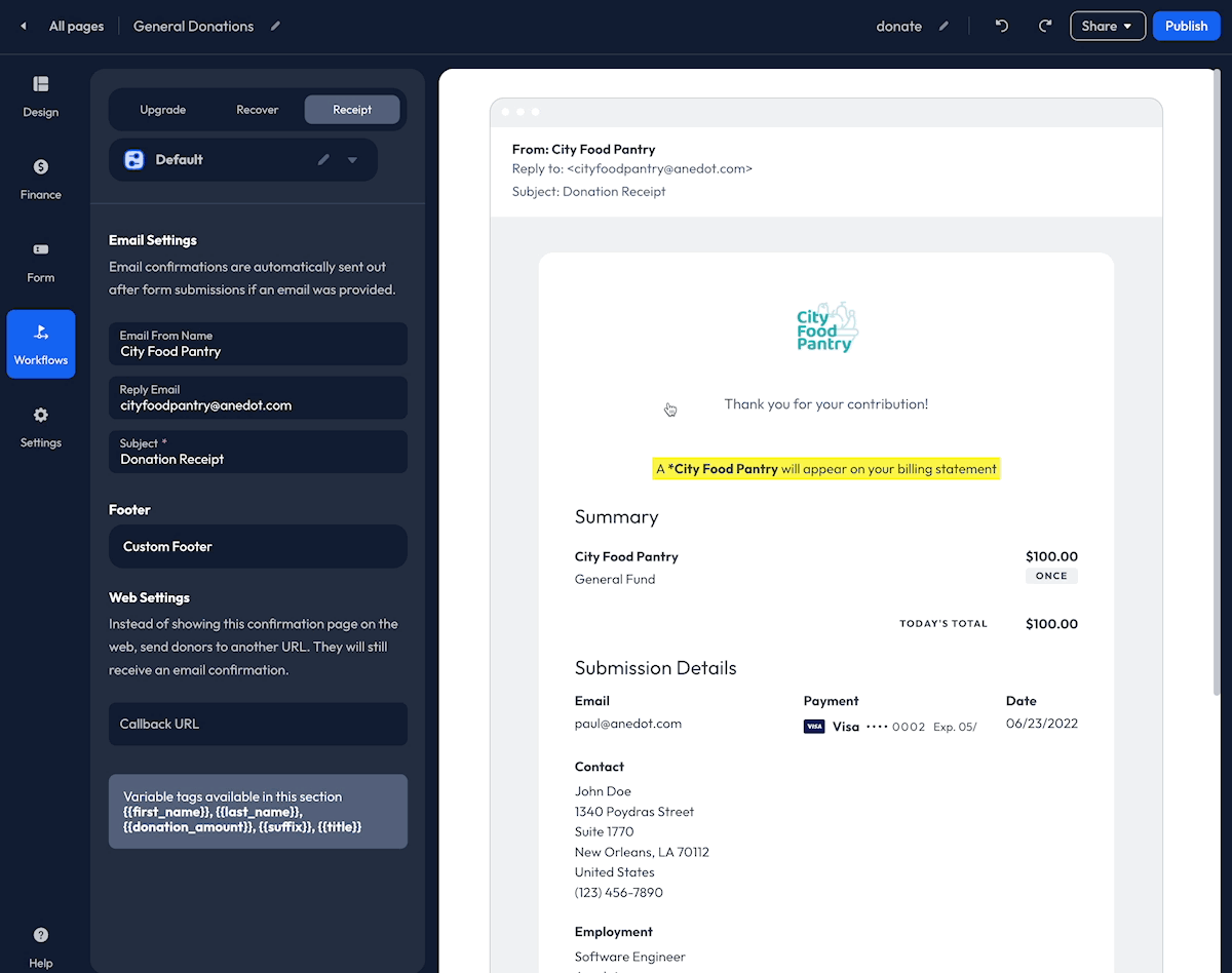
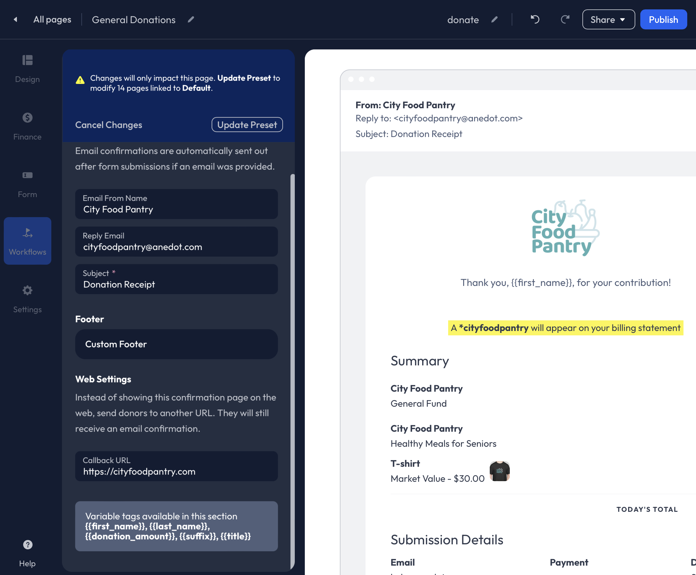
Receipts

Customize your Receipt within the Workflows>Receipt tab of the Builder.
When a successful submission is made through a Donation Page, donors will be redirected to a Confirmation Page and will receive an Email Receipt.
The following customizations are available for Receipts:
- Logo
- Message
- Email From Name
- Reply Email
- Subject
- Footer
- Callback URL
Receipt Logo
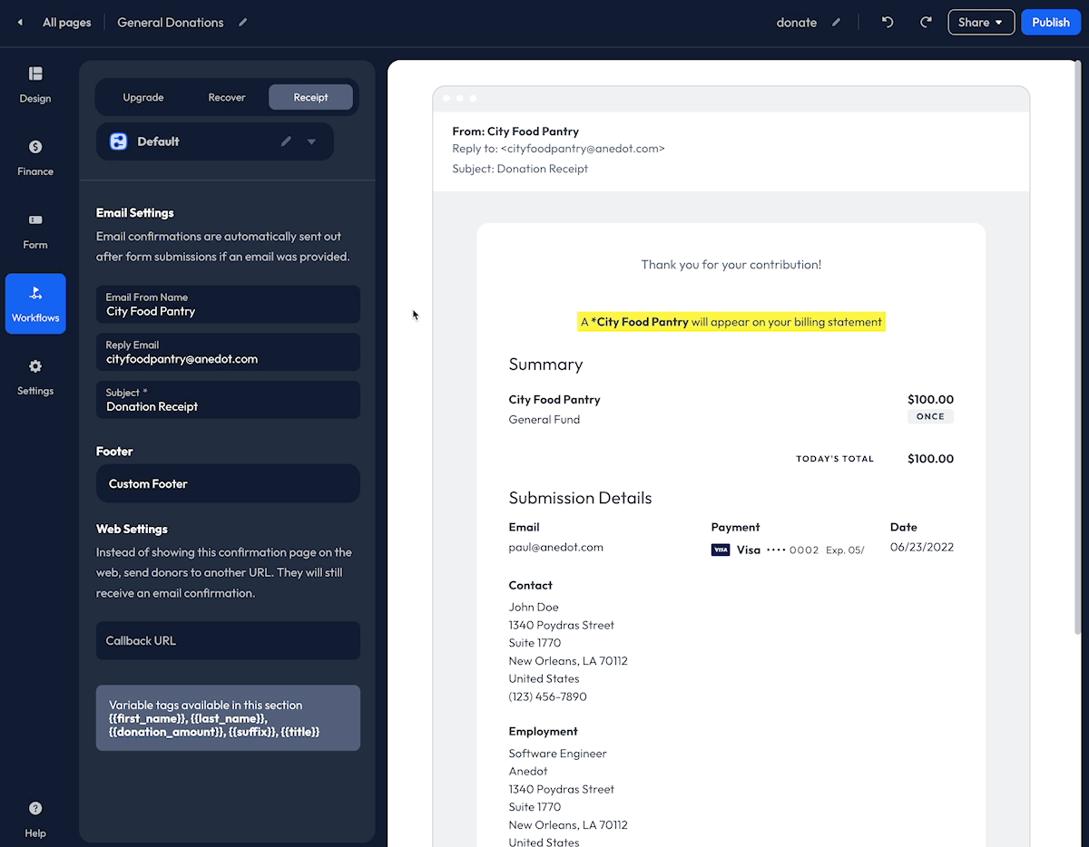
To add a Logo to your Receipt, click the space above the default Message included in the display on the right. You can then Drag + Drop an image, or click Browse to open the Media Manager. Within the Media Manager, you can upload a new image or select an image you have previously used for the fundraising account. The size of the Logo cannot be adjusted at this time.
Receipt Message
Sincere gratitude for your donors' generous support is the best way to let them know they are appreciated and encourage future support!
To add a custom Message to your Receipt, click on the existing Text that is included in the display of the Workflows>Receipt tab. A Text Editor will appear, allowing you to add your custom Message. Once you have added your custom Message, click Save within the Text Editor.
Example Messages:
- Our success is only possible with generous donors like you! Thank you again,
{first_name}, for your commitment and kindness. {first_name}, we couldn’t do it without you – thank you for believing in our mission and making a positive impact.- We are humbled by your generosity and thankful for your commitment to our cause. Your support makes a huge impact.
- We are sincerely grateful for your support. Your contribution makes all the difference!
Additional details to include in the Message:
- A link to the organization's website or social media pages
- Contact information for the organization
- A reference to the Fund the donor contributed to
- Details for upcoming events or volunteer opportunities
The following Variable Tags are available:
{first_name}{last_name}{donation_amount}{suffix}{title}
Callback URL
A Callback URL allows you to redirect your supporters to a unique page after a successful submission has been made.
Applying a Callback URL will override the Confirmation Page provided by Anedot. You may redirect your supporters to a new donation page, your organization's website, or a unique Thank You page built outside of Anedot.
To apply a Callback URL, access the Workflows>Receipts tab within the Builder. Within the Receipt tab, scroll to the bottom for the editor and enter the page URL into the Callback URL field.
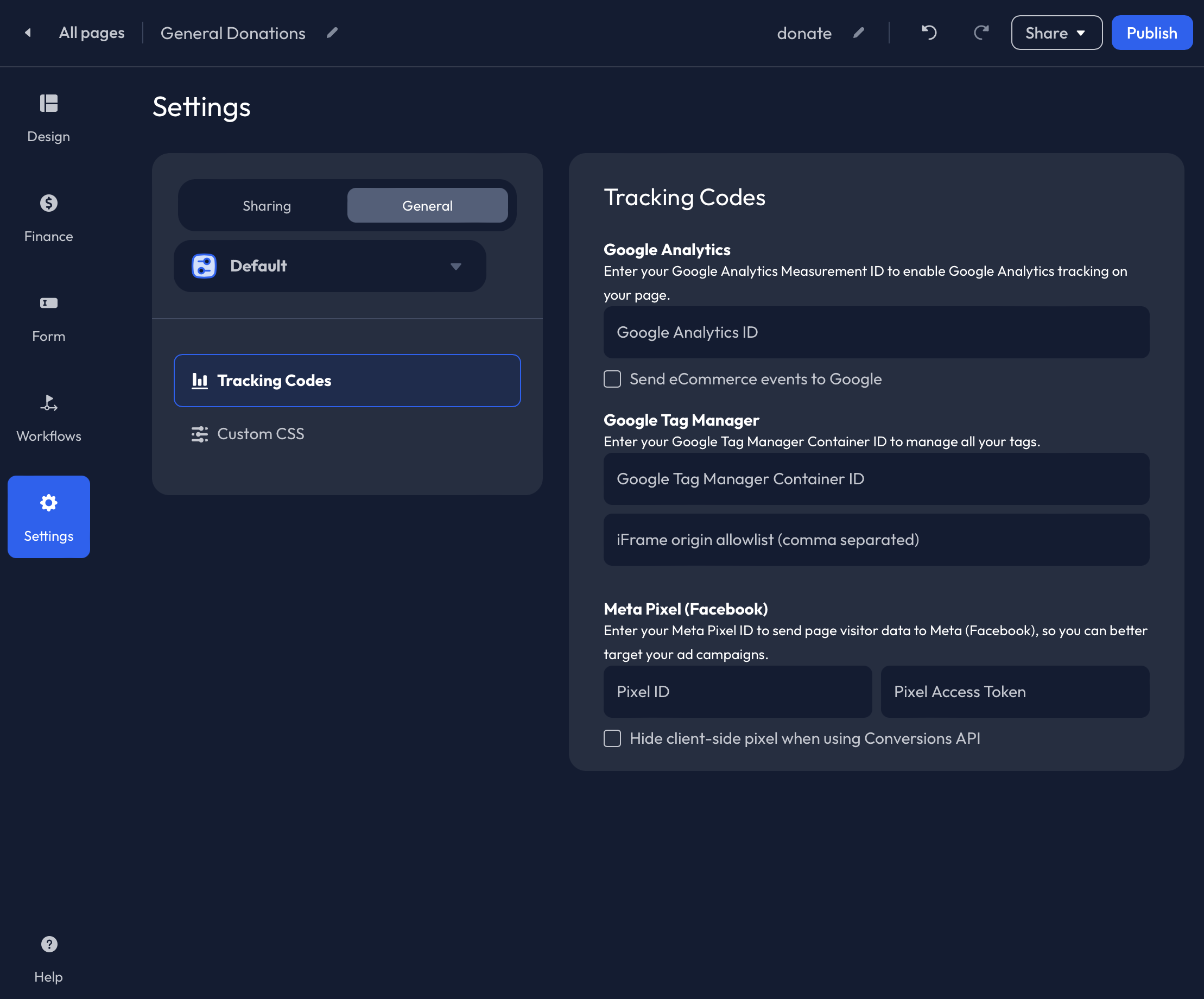
Settings
Within the Settings tab of the Builder, you can customize the SEO and Social Settings, and apply Page Values and Tracking Codes.
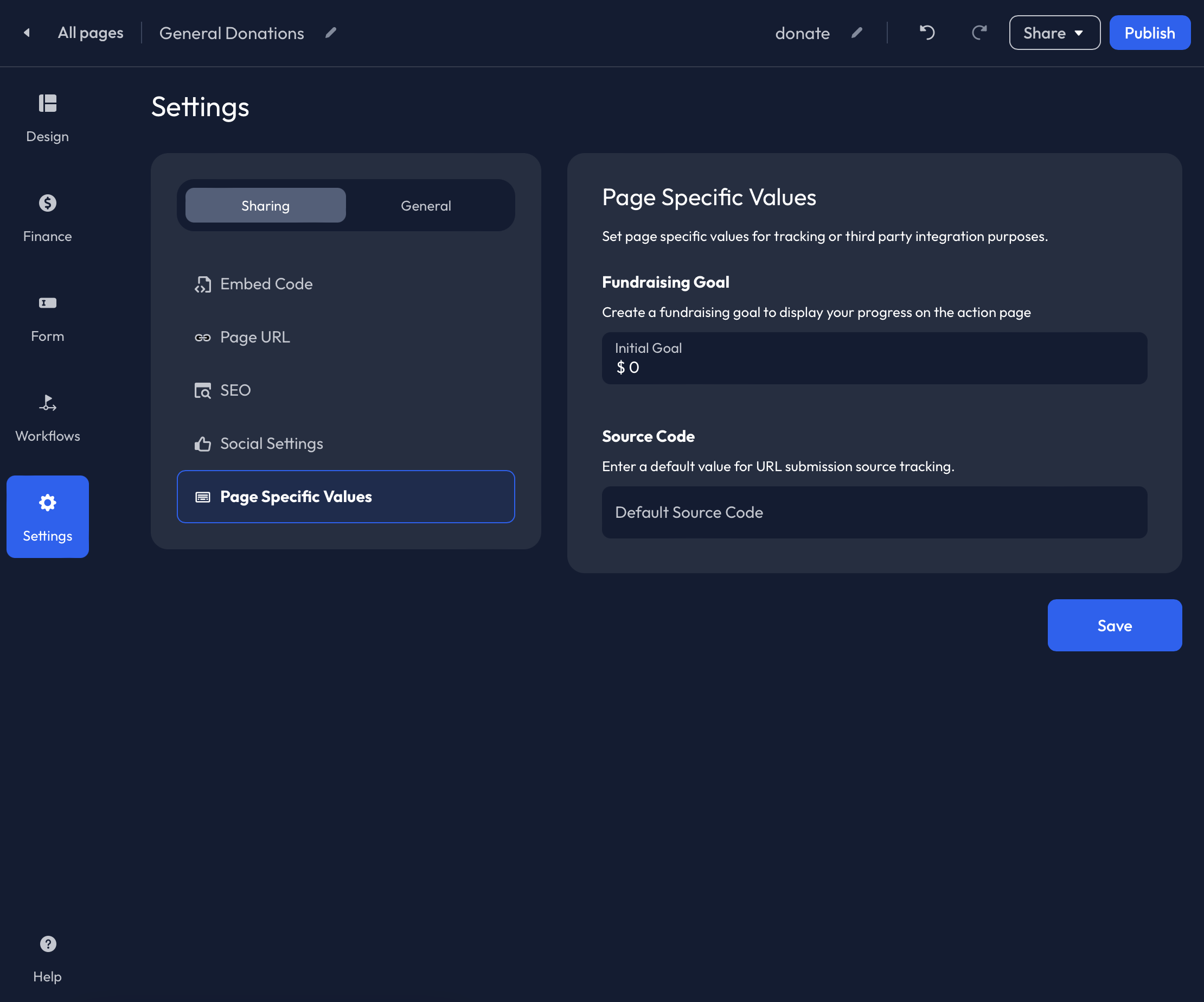
Sharing
Under the Settings>Sharing tab, you will find the following tabs:
- Embed Code
- Page URL
- SEO
- Social Settings
- Page Specific Values
Embed Code
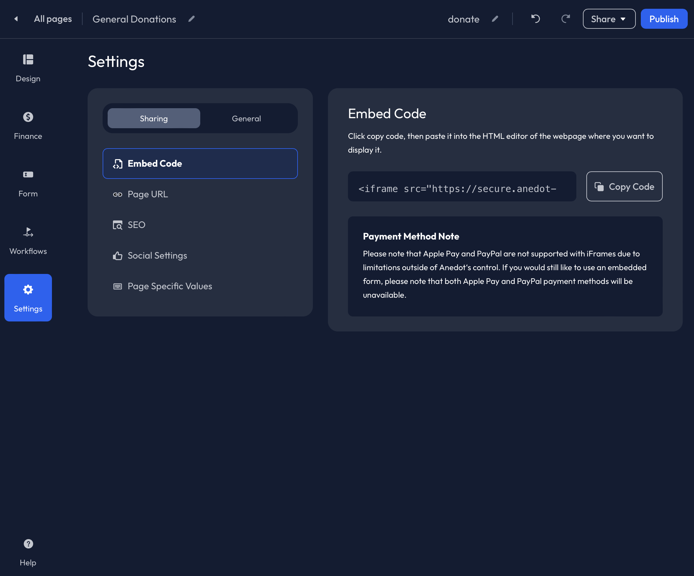
The Embed Code can be used to embed your Anedot Donation Page directly into your website using an iFrame.
While the Embed Code is available for power users, Anedot generally recommends utilizing the Hosted Page (Share URL) over iFrames. Here’s why:
- Embedded pages rely on your webpage security and may be less secure than a hosted page.
- You may have reduced conversion rates due to connection issues with the server.
- PayPal, Apple Pay, Google Pay, and Bitcoin are unavailable with embedded pages.
- Design elements and page disclaimers are excluded from embedded pages and require customization using HTML and CSS within your webpage builder.
- Supporters may experience errors accessing an embedded page from mobile devices.
When completing the setup of your webpage, we recommend testing the compatibility of your page with different browsers and devices.
You can review this guide to troubleshoot iFrames.
Page URL
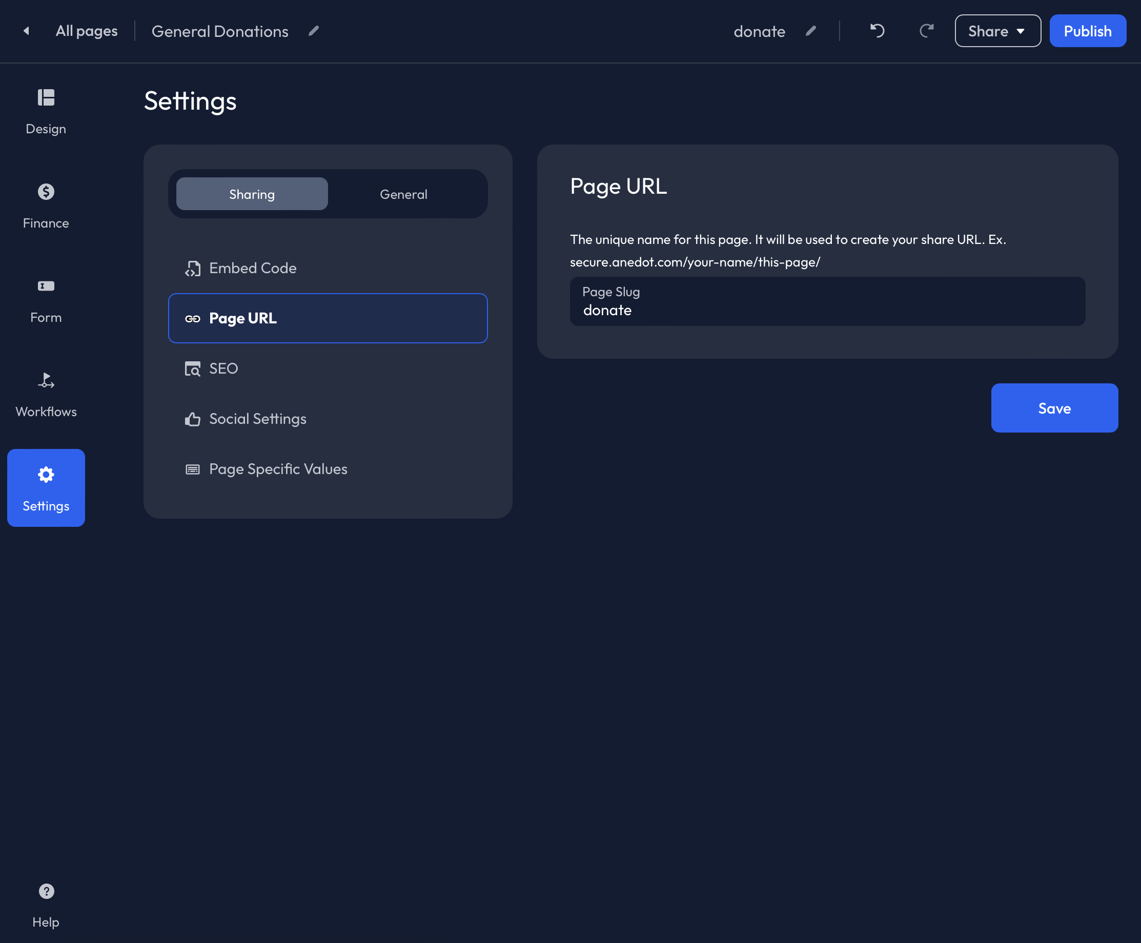
The Page URL is what makes each individual Action Page unique. If you have already used /donate as the Page URL for another Action Page, it cannot be used again.
Examples: give, contribute, giving-tuesday etc.
The Page URL can also be customized at the top of the Builder. Click the Pencil icon to the right of the Page URL to edit.
SEO
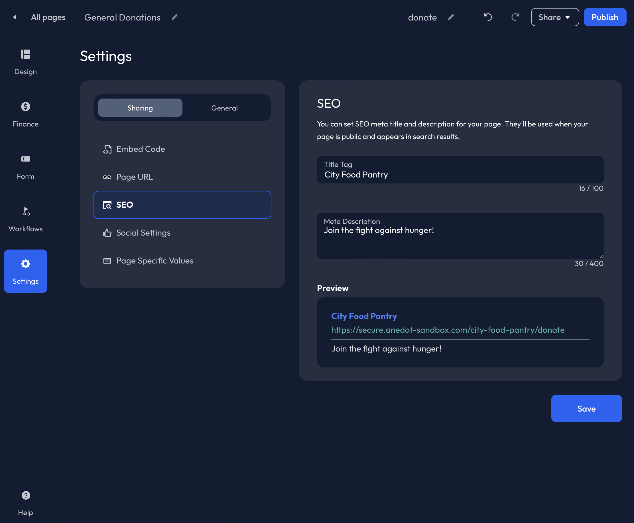
Customize the SEO (Search Engine Optimization) by adding a Title Tag and Meta Description. This information will be used when your page is public and appears in search results.
Social Settings
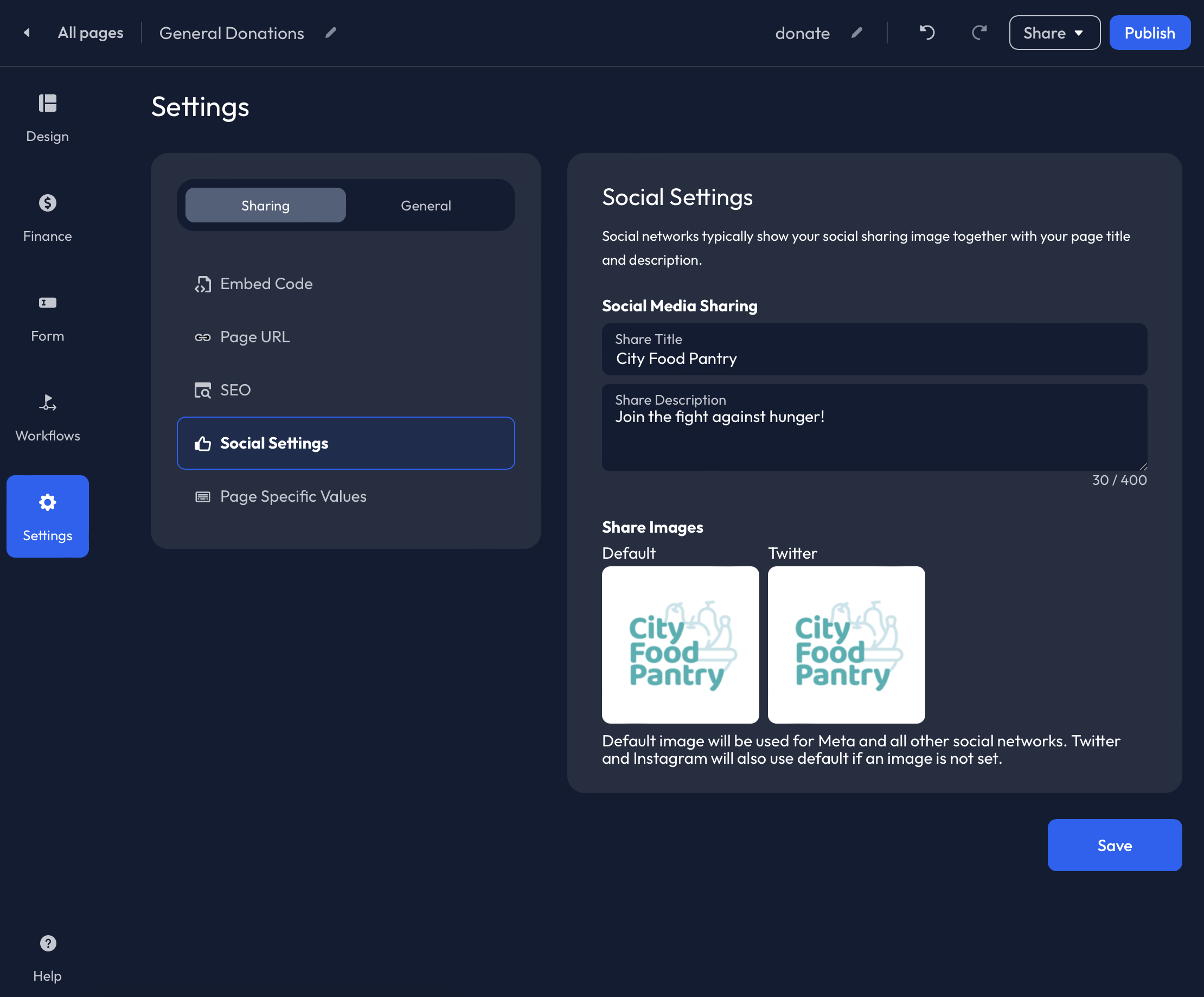
Add a Share Title, Share Description, and Share Images to the Social Settings tab. This data will auto-populate when the Action Page is shared on social media platforms, and through text.
Page Specific Values
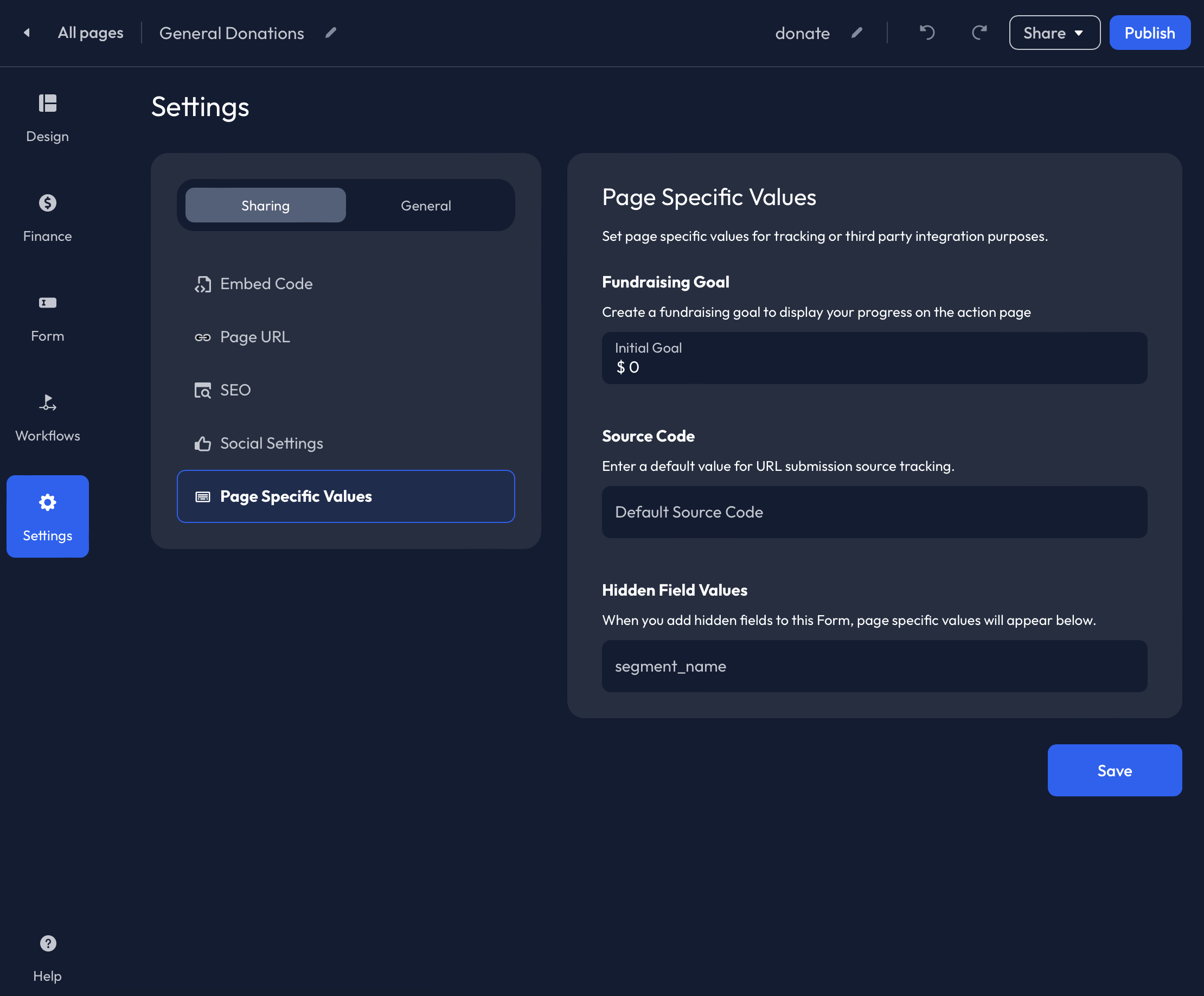
Within the Page Specific Values tab, you can set a fundraising Goal and add a Source Code and Page Values for Custom Hidden Fields.
Enter an Amount within the Goal field to visibly track fundraising success on the Donation Page. Continue to the step below to learn more!
A Source Code can be applied at the page level in the Default Source Code field. When a Source Code is applied, it will show within the Page URL. You can remove this from the Page URL and the Source Code will still track successfully.
When Custom Hidden Fields are added within theForm tab of the Builder, you will be able to apply a custom Page Value for the Hidden Field Key on this tab. This is tracked as a separate field from the Default Source Code.
Goals
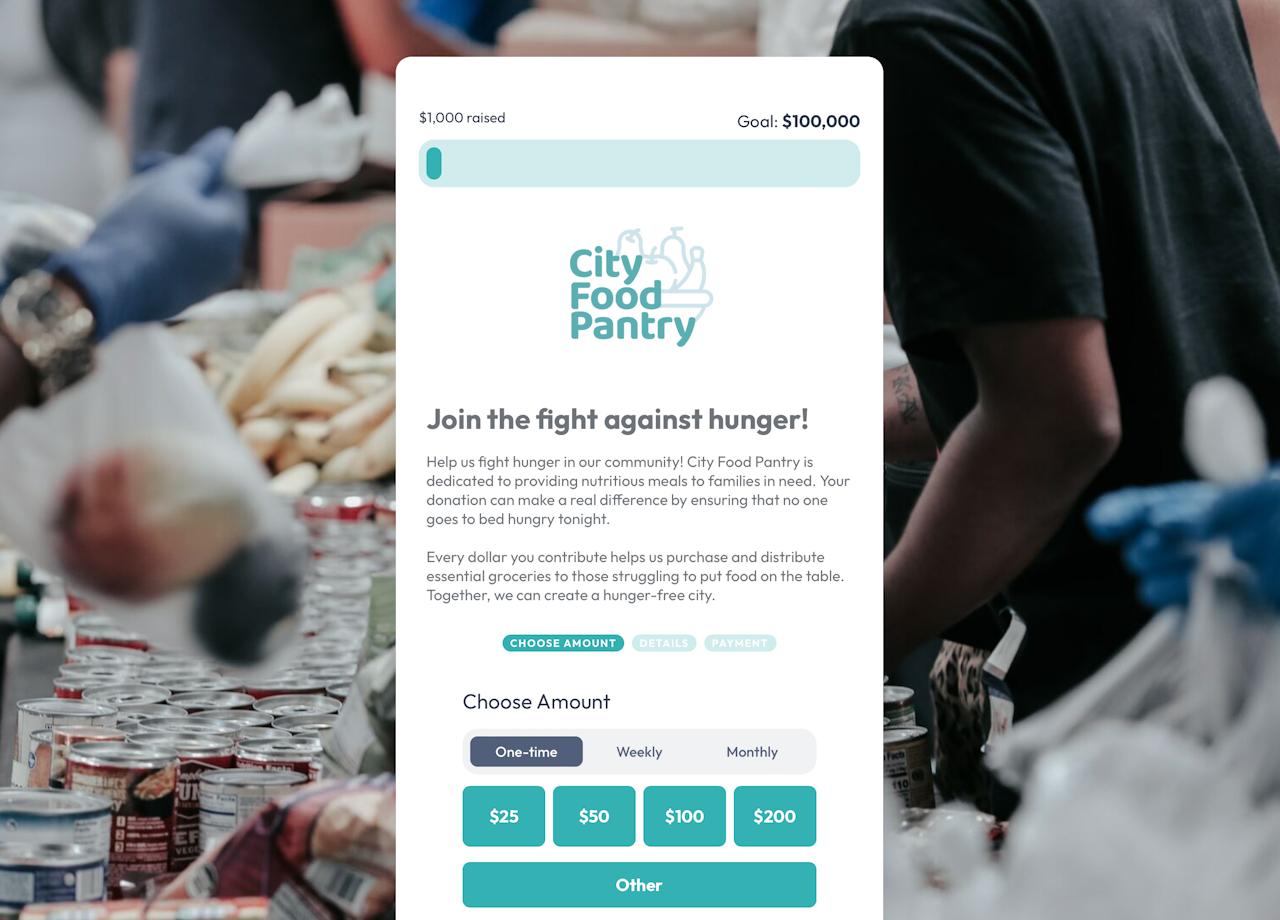
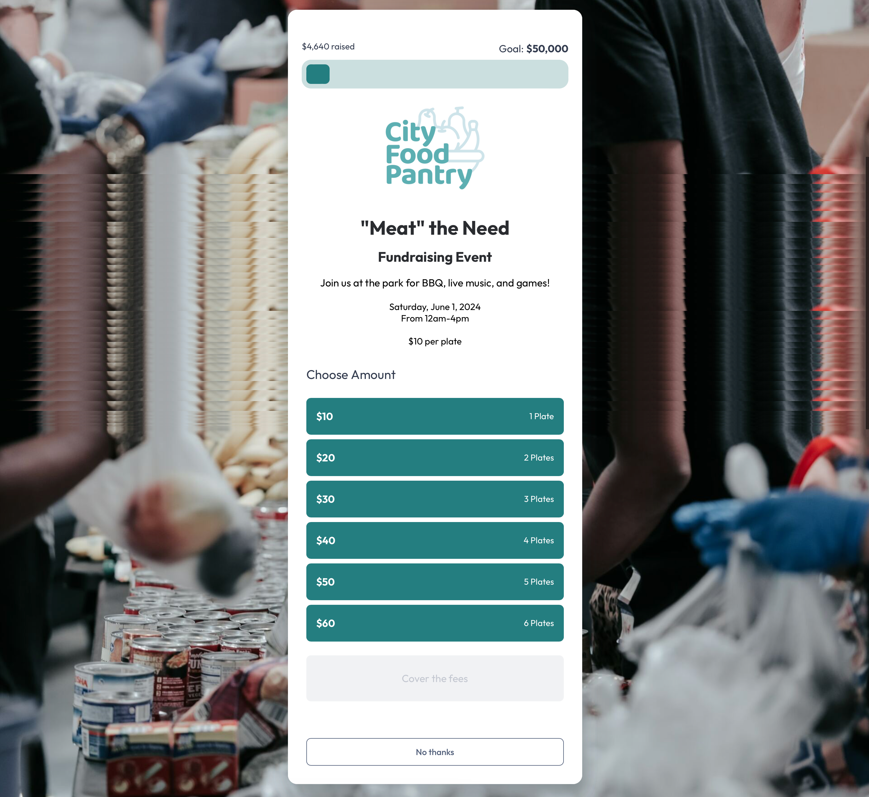
When an Initial Goal amount is applied to the Action Page, a Goal Tracker will appear at the top of the public Donation Page.
The Goal Tracker updates in real-time and will include Completed donations.
The Goal amounts and percentages are shown as rounded to the nearest whole percentage. The amount is then rounded accordingly to a whole amount.
Example: If the Total Raised amount of Completed donations is $141,540.85 and correlates to 12.87% of the goal, we will round the goal percentage to 13% and show a whole amount of 143k on the public page.
Optionally, an External Amount can be added to the Goal to account for funds raised offline.
Once the Goal is met, you can access the Builder to increase the Goal, or remove the Goal from the page.
General

To add Tracking Codes and Custom CSS to your action page, access the Settings-General tab within the Builder.
For further information on how to set up tracking for Anedot pages, check out our Tracking Codes guide here!
To request access to Custom CSS, please contact our Support team here.